
What a logo mockup is for
A logo mockup is a picture of a logo on a real-looking thing: raised letters on a wall, a sign over a door, vinyl on a window or print on a cup. It lets you judge a logo as an object instead of a flat file, show it to a client or a landlord, and present a brand before a sign is ordered or a cup is printed.
New businesses, designers and small shops use mockups for the same reason: a logo on a white page tells people little, and a logo in a place tells them a lot. A useful mockup answers a few questions at a glance. Does the logo read from across the street? Does it hold up on a dark door or a wooden sign? Do the letters stay clear when the object is seen at an angle? This page explains how to get such a picture in FlowPix, and where the limits are.
How to make a logo mockup with FlowPix
Open the app and attach your logo as a reference picture. Then describe the place or the object the way you would brief a photographer: a reception wall, a hanging sign, a glass door, a cup and a card, the light and what else is in the frame. FlowPix generates a photo that carries a version of your logo. There is no mockup template to choose and no file to drag onto a fixed shape; you say what you want to see and the image generator draws it.
Treat the first result as a draft. Look at it closely and ask for changes in plain words: make the logo larger, use a darker wall, show the sign from the front. Each request produces a new picture, so you can keep what works and change one thing at a time.
On a wall, a sign, a door and a cup
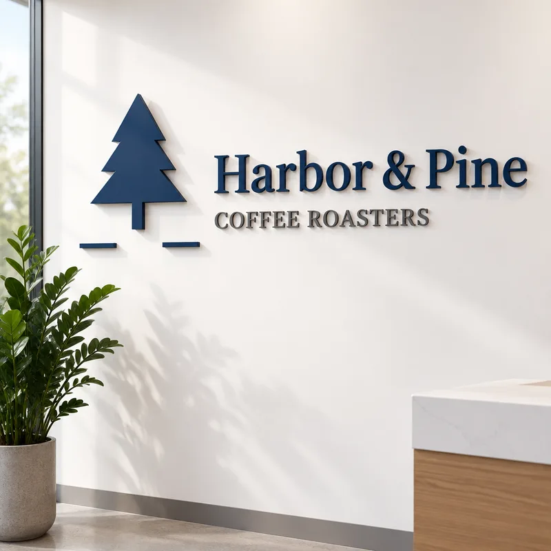
Raised letters on a white wall show a logo as a piece of the building, with a shadow that gives it depth, and suit an office, a studio or a clinic. A hanging wooden sign over a storefront shows how a logo reads on a street, and a good test of whether the lettering is clear from a distance.
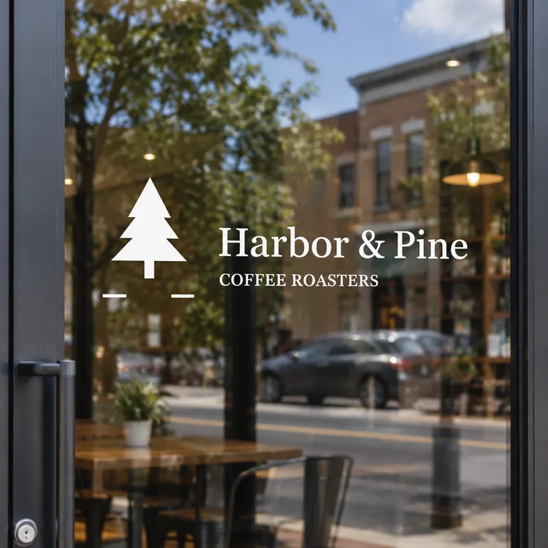
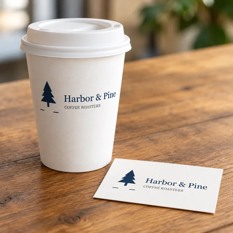
A logo in white on a glass door shows how it looks as vinyl, with the street and the shop behind it. A paper cup next to a business card puts the logo on the things a customer takes away. For each of these, say what color the logo should be on that surface: dark on a light wall, white on glass.
What we saw in our tests
We tried four scenes with one logo. It is a logo we made for the test, with an invented name: a pine tree, the name Harbor and Pine in a serif typeface, and a small line under it, Coffee Roasters. The four pictures on this page are the real results of those runs, not edited afterwards. The scenes were raised letters on an office wall, a hanging wooden sign, white vinyl on a glass door, and a paper cup with a business card.
In all four the name and the small line were spelled right, and the tree was easy to recognize. But the logo is redrawn each time: the typeface was close to ours and not the same, on the wall it was heavier, and the spacing between the tree and the words shifted a little. On the glass door the logo came out white, as we asked. The two short dashes under our tree were kept in every picture. The walls, signs, doors, cups and cards are drawn by the model.
What it does not do
FlowPix does not place your file onto a fixed shape, so it does not keep the exact shapes or the exact typeface of your logo. It does not make a vector file or a print file, it does not know the real size, material or finish of a sign or a wall, and it is not a proof for a sign maker or a printer, so do not use a mockup to check sizes or colors. It is also not a photo of a real place.
We tried one logo with a short name. Longer names and very small text are untested, and writing is the part most likely to come out wrong, so look at the result at full size. Keep your original logo files, and ask whoever makes the sign for its file rules.
Getting a better picture
Start with a clean logo on a plain background, with room around it. Say what color the logo should be on the surface, and how big it should be: a large emblem on a wall, a small mark on a cup. A short name survives being drawn again much better than a long line of small text.
Change one thing at a time. If you want a different surface or a different light, say only that and keep the rest of your description the same, so you can compare the pictures side by side. Keep your original file, look at every result at full size, and use only logos you have the right to use.
Make the logo first
A mockup needs a logo to show. If you do not have one yet, start with our AI logo generator, which designs logo directions from a short brief. Then bring the logo you chose here, and put it on a wall, a sign, a door or a cup.