

What black and white means here
A black and white photo is a photo with no color in it, only light and dark. In practice it is not made of only black and white: it has every gray in between. Photographers call it black and white, and image editors usually call it grayscale. That is what this page is about: the same picture, with each color turned into the gray that has the same brightness.
There is a second meaning that people sometimes search for: a picture with only two colors, pure black and pure white, with no grays at all, like a photocopy. That is a different thing, and FlowPix does not make it. You can read more under what it does not do.
How to make a photo black and white in FlowPix
Put the photo on the FlowPix canvas and select it. Open Adjust, and in the Color section you will find a switch called Black and white. Turn it on and the preview turns gray. Turn it off and the color comes back, so you can look at both before you decide.
Press Save as new image. FlowPix puts a new black and white picture beside the original, at the same size in pixels, and the original goes back to how it was. If you would rather keep working on the same picture, press Done: the setting stays on it, and you can open Adjust later and turn it off again.
No model is involved and nothing is generated, so the same picture with the same settings always gives the same result. You do not need to run it again to see whether it comes out differently.
Set the grays before you save
Taking the color out also takes out one of the things that made a picture easy to read. Two colors that were different but equally bright turn into the same gray, so a red flower against green leaves can lose its edge, and a flat gray picture is the usual disappointment.
The other Adjust sliders keep working while Black and white is on, so you can fix this before you save. Contrast pulls the grays apart. Exposure and Brightness make the picture lighter or darker. Vignette darkens the corners. Look at the preview, change one thing at a time, and then save.
Why the Saturation slider is not the same
Many people try Saturation first: lower it to the bottom and the color should go. In FlowPix it does not go all the way. We checked on a picture in which every pixel had a different color: with Saturation at its lowest, the pixels were still different colors, only paler.
The Black and white switch does what a gray needs. For every pixel it sets red, green and blue to the same value, so no trace of color is left. The value is chosen by brightness, with green counting the most, then red, then blue, because that is how the eye judges brightness.
What we checked
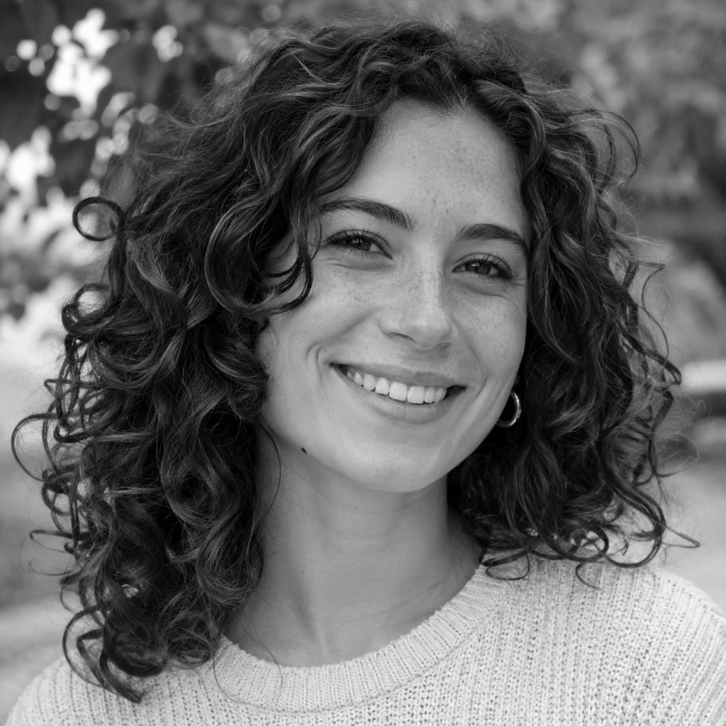
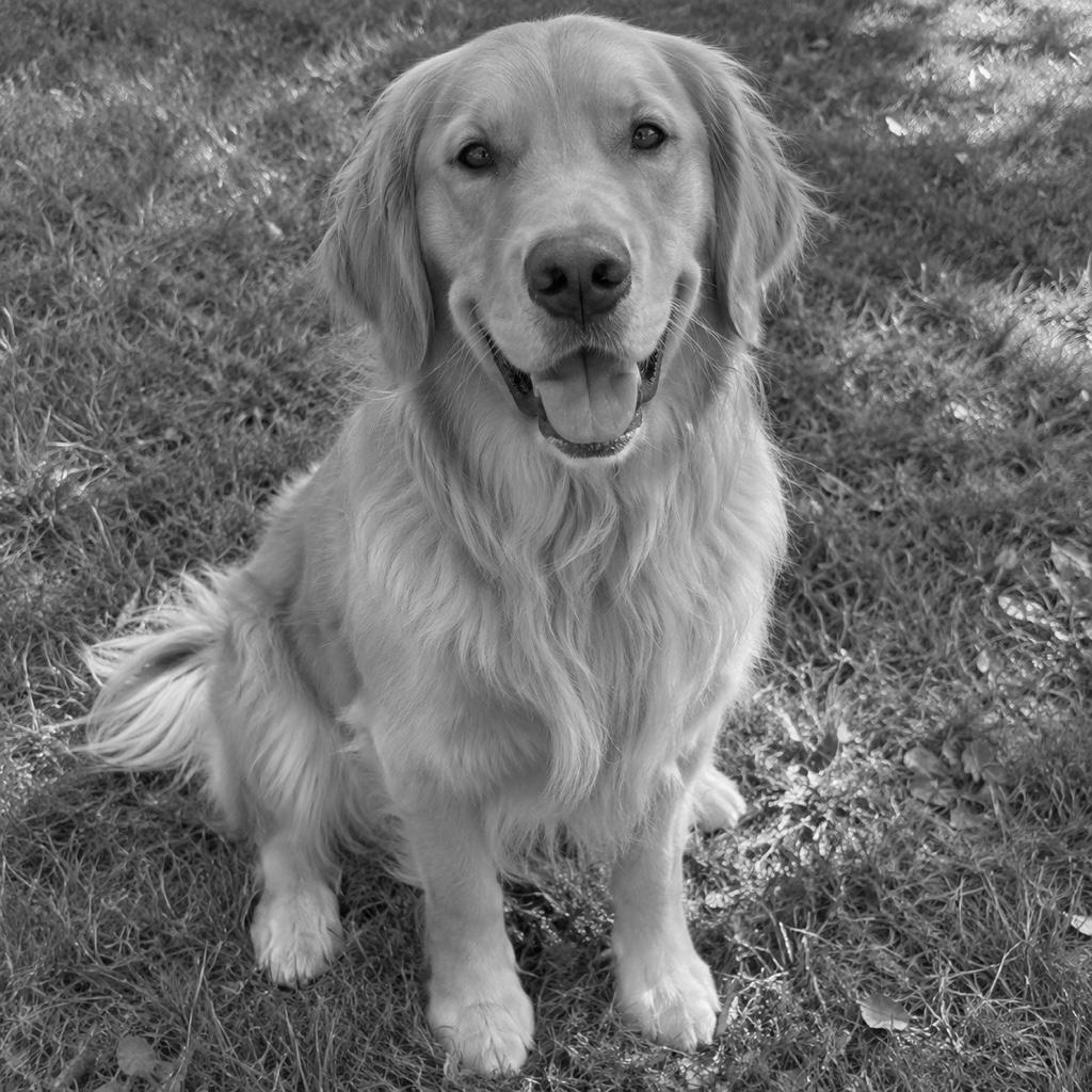
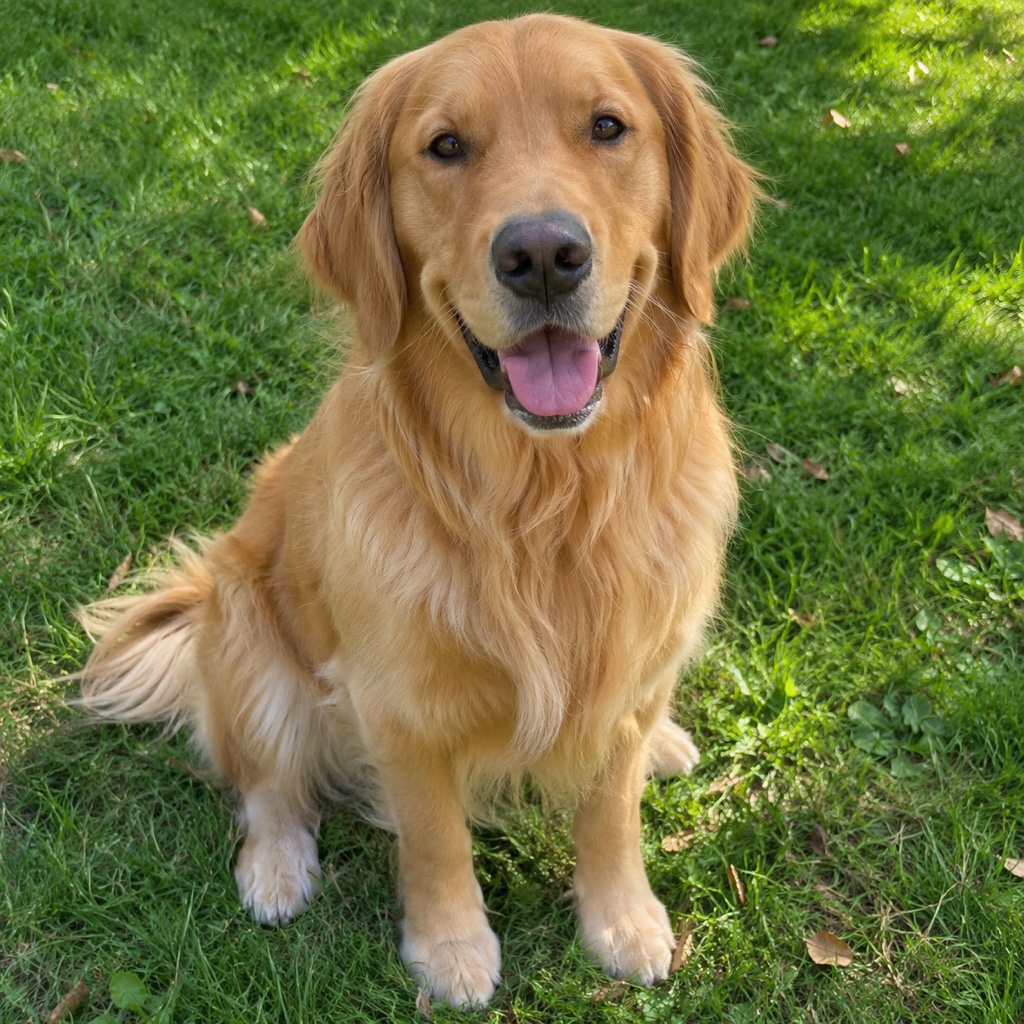
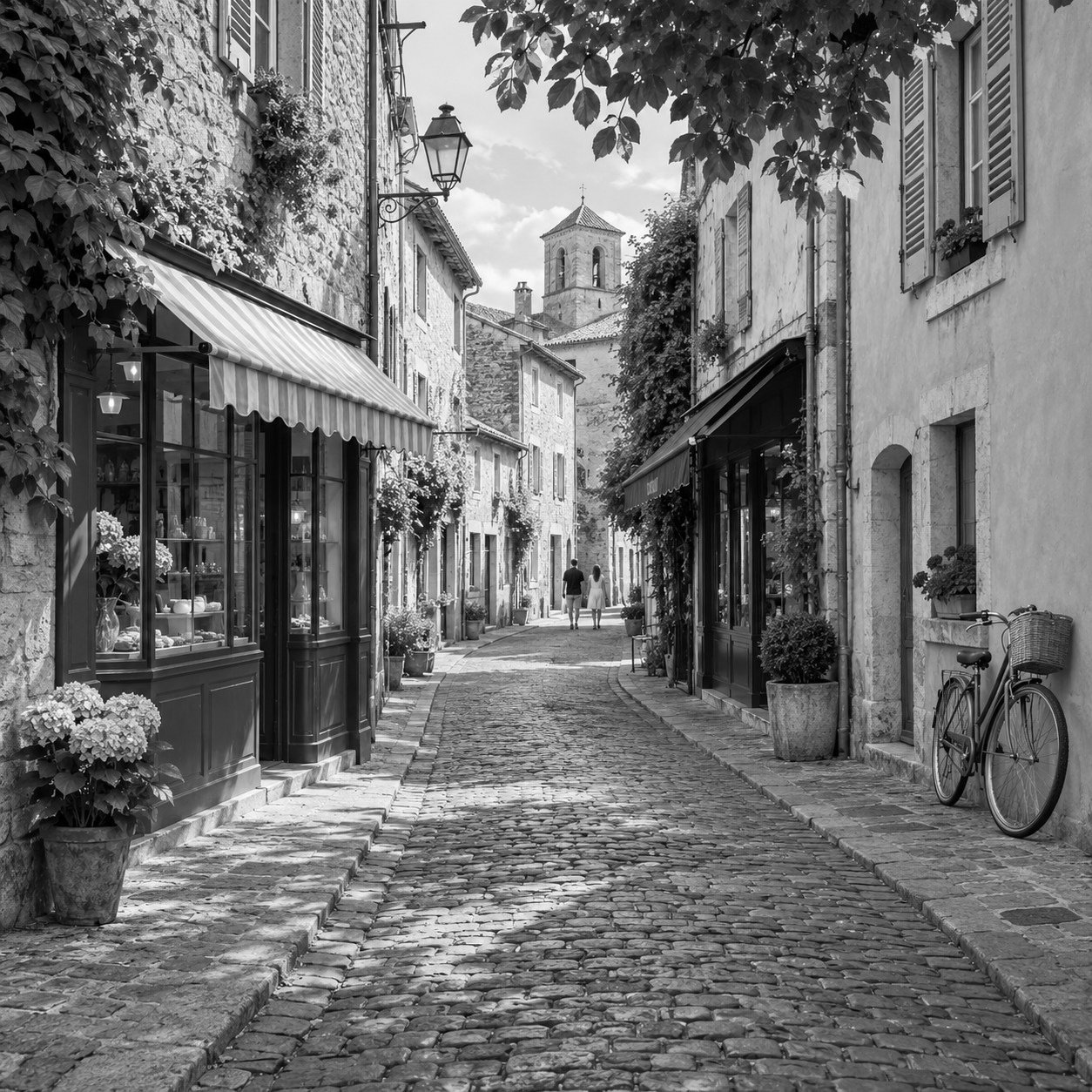
We made three pictures black and white and checked them pixel by pixel: a portrait, a dog on a lawn and a street. They are pictures we generated ourselves, not photos of real people or pets, and the results are the real output, not edited afterwards. The three sliders on this page show them.
In all three, every pixel had the same red, green and blue value, and the picture had the same size in pixels as the original. Each gray matched the brightness of its pixel in the original, to within one step of rounding. On a PNG with a transparent background, the transparent part was exactly as it had been.
One thing changed that you may notice: the saved picture is a PNG. The two JPEG photos became files about three times as large, and the PNG street picture became smaller. If the file size matters to you, check it after you download.
What it does not do
It makes a whole picture gray. There is no way to select an area, so it cannot keep one flower in color, and it works on one picture at a time.
It does not make pure black and white with two colors. There is no setting for that, and Brightness or Contrast do not make it either: they only move the grays around.
It does not add color to an old gray photo either. Going from gray to color is a different job, and this page does not cover it. If you want the color picture again, use the original, which Save as new image leaves as it was.
When black and white works well
Black and white suits pictures that are about light and shape more than color: portraits, faces with strong light on one side, buildings, streets, textures and a dog's fur. It is also a quick way to calm a picture with clashing colors, or to make several pictures from different cameras look like a set.
It suits a picture less when the point is the color, such as a red coat in a crowd or a sunset. Try it and compare it with the original side by side on the canvas before you decide, and keep the original either way.