What a colour changer for images does
A colour changer for images changes the colour of something in a picture: a jacket, a car, a wall, a product, a flower. The aim is usually specific. You do not want the whole photo to look warmer or cooler; you want one thing to be a different colour while the rest looks the same.
This is different from the colour controls in a photo editor, which shift hue, saturation or brightness across a layer or a selection, pixel by pixel. FlowPix works from a description. You say what should change and what colour it should become, and the picture is redrawn with that change.
How to change the colour of an image with FlowPix
Open the app, drop in your picture and describe the change in a sentence: recolour only the hoodie to deep forest green and keep everything else the same. FlowPix returns a new version of the picture. Because both versions are on the canvas you can put them next to each other, or slide between them, and see exactly what moved.
If the colour is not quite right, say so in plain words. Ask for a lighter green, a warmer red, a more muted blue. Each request produces a new picture, and each one uses credits from your balance, so look closely before you ask again.
What to expect from the result
The picture is redrawn, not recoloured pixel by pixel, and it is worth knowing what that means. The new colour is usually clear and convincing. The background, the pose and the light stay close to the original when you ask for them to. But the shape of an object, its folds, a drawstring or a seam can change slightly, because the picture is made again.
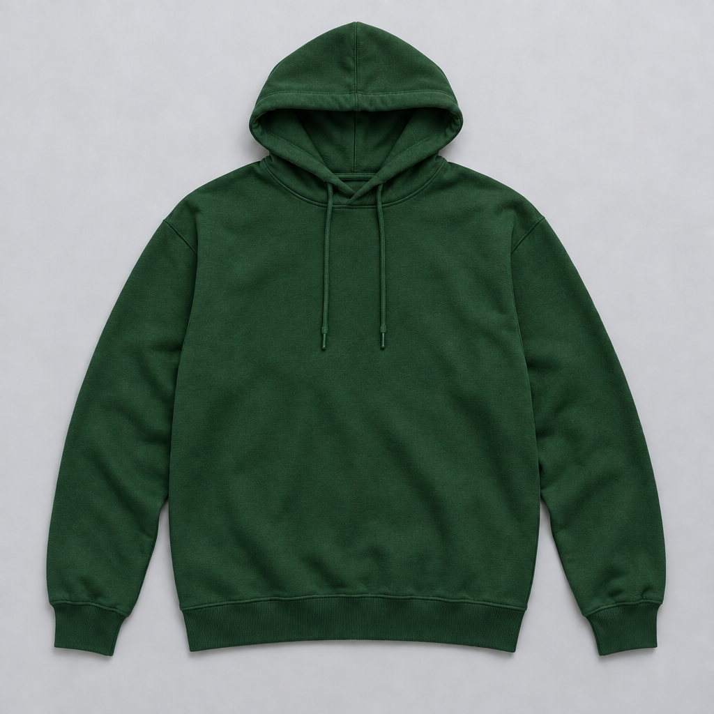
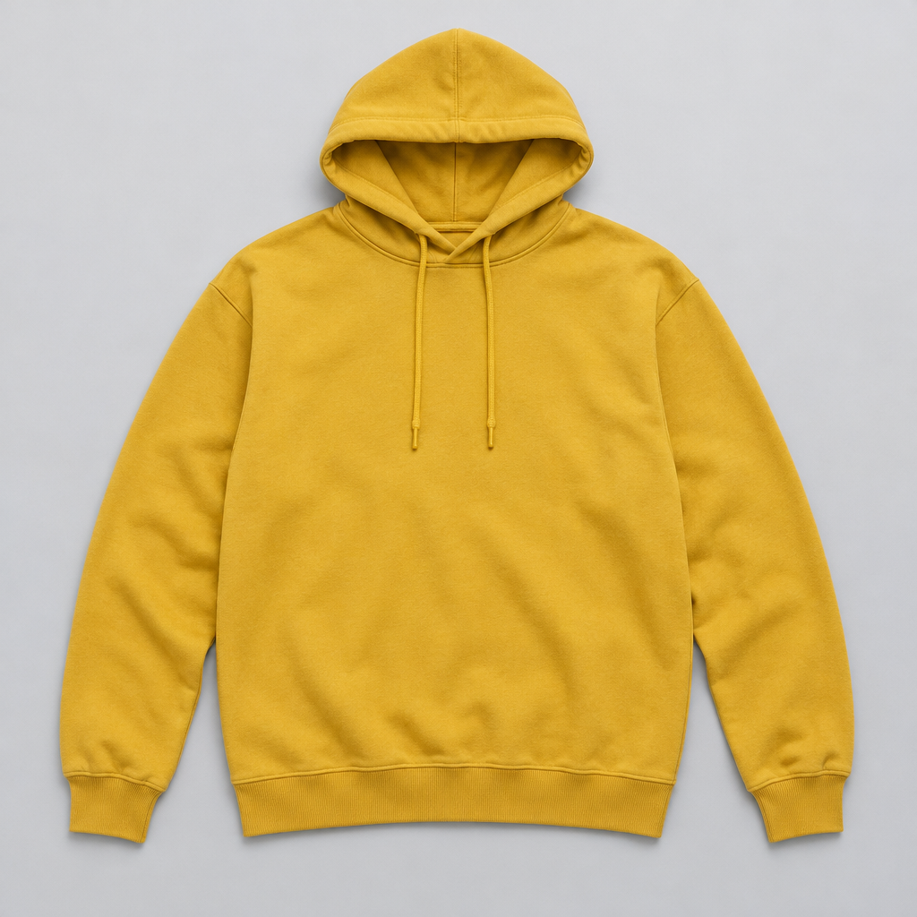
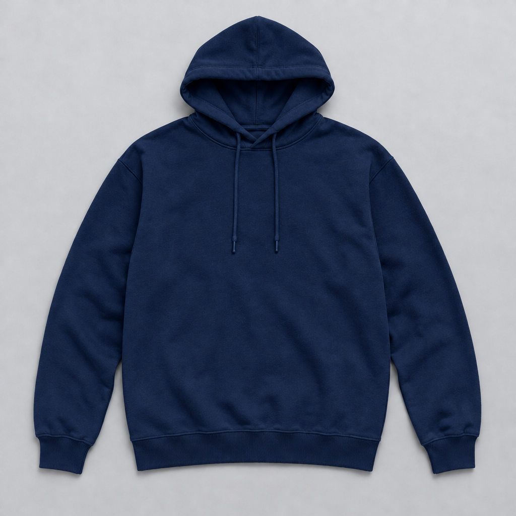
The two examples on this page show it. The yellow hoodie became forest green and navy blue, and the colour change is obvious at a glance. If you look closely at the hood and the drawstrings, you will see small differences from the original. For many uses that does not matter. If it does, ask again, or use the version that stays closest.
Treat the first result as a draft. Look at the object, the edges and the background, compare it with the original, and decide whether it is close enough. If it is not, run it again with a clearer sentence. A second or third try is normal, and you are the judge of what is good enough for your use.
How to get a result closer to what you want
Describe the colour in words that carry a picture: deep forest green, dusty pink, off-white, mustard. Add the finish when it matters, such as matte cotton fleece or glossy paint. Say what must not change: the shape, the folds, the background, the lighting.
Start from a sharp picture in which the object is clear and not hidden by something else. Name the object precisely, so the change does not spread to other things of a similar colour. If you only want a part of the picture changed, say which part, or mark that area in the canvas and describe the result you want there.
Where changing colours is useful
Stores use it to show a product in more colours than they have photographed, to decide which colours to make, or to build the colour row of a product page. Designers try palettes on a garment, a piece of furniture or a wall before they commit. Marketers refresh a picture they already have to fit a campaign or a season.
It is also a quick way to explore. A single photo can become five directions in a few minutes, and a picture of a room can show a wall in three colours before anyone picks up a brush. Use the results to decide and to show an idea, and keep the real photographs for what you actually have.
A common routine is to start from one good photograph of a product, ask for three or four colours, and put the pictures in a row. That row is enough to test interest, to choose a colour for a first production run, or to fill a product page while the real stock is still on its way.
Exact colours and brand shades
A generated recolour reads the colour from your words and from the picture. It does not take a colour code and apply it exactly, so a brand shade is not guaranteed to match to the digit. Describe the colour as well as you can, look at the result on your screen, and ask for a lighter or darker version until it is close.
When you need a precise match, for printing or for a brand guide, check the result against the real colour and use a dedicated colour tool for the final file. The recoloured picture is for showing the idea; the exact value should come from your own colour standard.
A generated recolour or a colour adjustment
A colour adjustment in an editor changes the pixels you select in a predictable way. It keeps every detail exactly as it was, and it is the right tool when you want a precise, repeatable change, such as shifting a whole picture warmer. It needs a clean selection, which can take time around hair, shadows and fine edges.
A generated recolour is quicker when you can describe the change in a sentence and you accept that the picture will be redrawn. It handles an object with folds, light and shadow without you drawing a selection. Many people use both: try the idea with a description, and finish an exact value with a colour tool.