What a packaging mockup is for
A packaging mockup is a picture of a box, bag, pouch, bottle, jar, tube, can or label that has not been produced yet. It shows how a design, a colour or a shape would look as a real object on a shelf, in a hand or on a table, so you can judge it, show it to someone or find out whether people are interested before you order a print run. Small food and cosmetics brands, candle makers and print-on-demand sellers use mockups to test names and colours, and designers use them to show a client a concept.
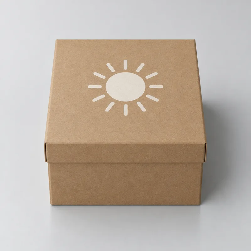
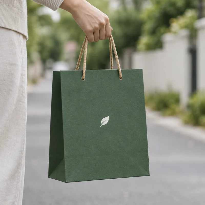
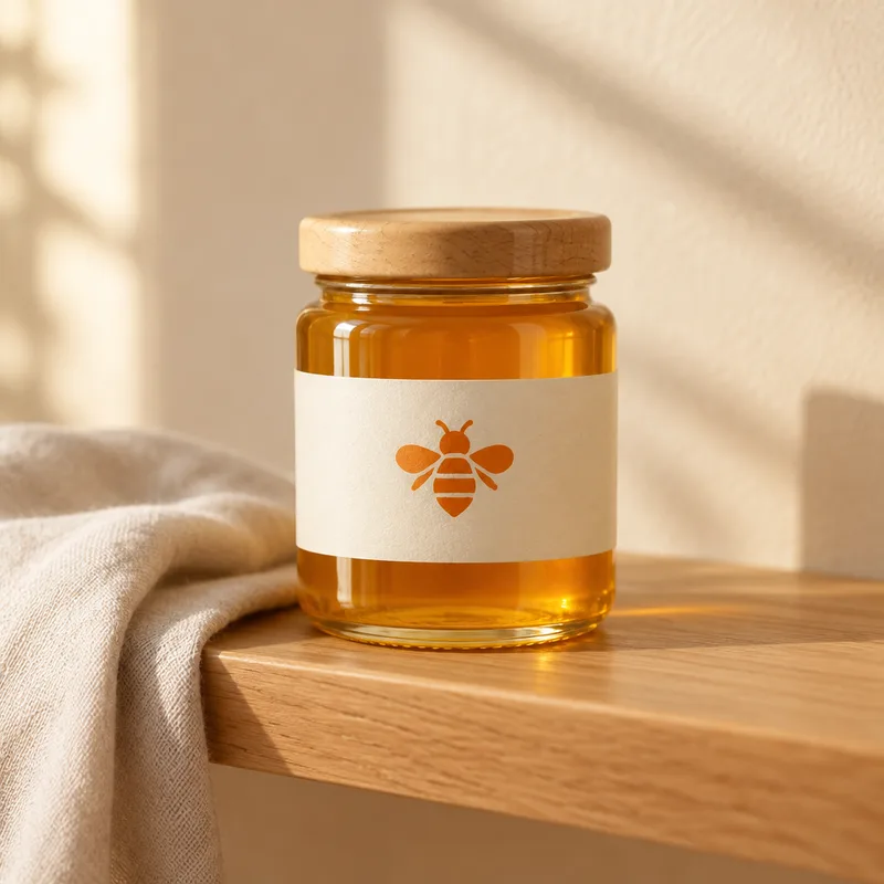
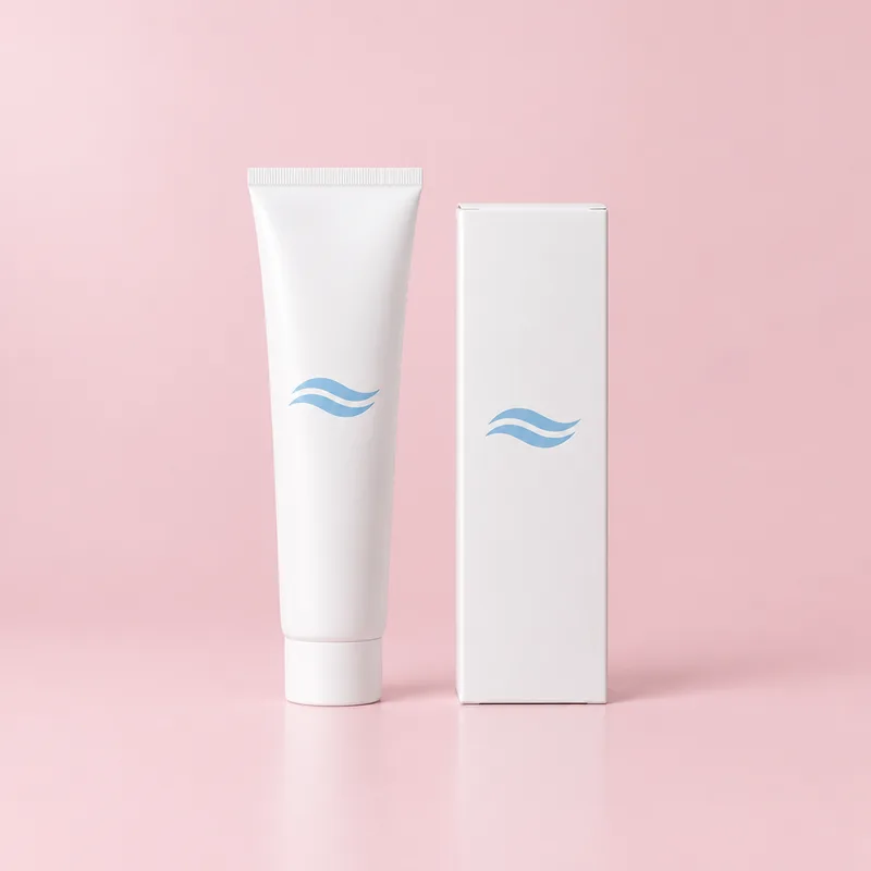
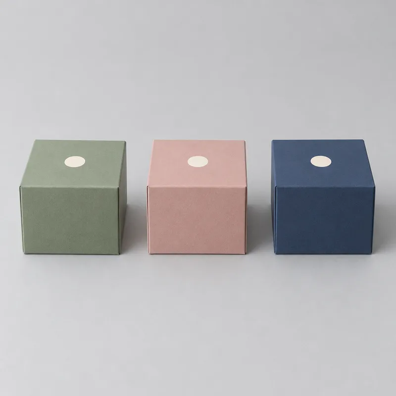
A good packaging mockup answers a few questions at a glance. Does the pack look believable as a physical object? Can the brand name be read at the size a shopper would see it? How does it sit next to the other products in the range? The pictures on this page were all generated from short descriptions of exactly this kind.
How to make a packaging mockup with FlowPix
Open the app and describe the pack the way you would brief a photographer: what kind of pack it is, the material and the colour, the brand or product name and the design, and the scene around it. Two or three sentences are enough. FlowPix generates a realistic packaging photo from that description. There is no template to choose and no file to place; you simply say what you want to see.
If you already have a logo or label artwork, attach it as a reference and say where it should go: the front of the box, the middle of the label, the lid of the jar. FlowPix draws a version of it on the pack. Because the picture is generated rather than pasted, treat the first result as a draft, look at it closely and ask for changes in plain language: make the logo smaller, move the name higher, make the box a shade lighter.
Describing the pack, the material, the design and the setting
Be specific about the things a photo cannot guess. Say what the pack is and roughly what shape it has: a tall rectangular box with a tuck-in lid, a stand-up pouch with a zip, a squat glass jar with a metal lid, a slim tube with a flat cap. Name the material and the finish in plain words, such as kraft paper, matt white card, glossy foil, clear glass or brushed metal, and give colours as ordinary colour names like terracotta, sage green or cream.
Then describe the design and the scene. Say where the logo or the name goes and roughly how large it is. Add the setting in one line: a flat lay on a pale table with a sprig of leaves, standing on a shop shelf among other products, held in a hand in front of a plain wall, or alone on a studio backdrop. Ask for no text when you do not have a name yet, because generated lettering is the least reliable part of any picture. When you do want words on the pack, keep them short, one or two words, and check the spelling in the result.
Colourways, angles and sets
To show the same pack in several colourways, name the colours in one message and ask for them side by side, or make one picture you like and ask for the same pack in another colour. You can also ask for several angles in a row: straight on, from above at a slight angle, a close-up of the lid or the seal, the pack in a hand, the pack on a shelf. Each picture is redrawn, so edges, folds and shadows can differ a little from one version to the next. That is normal for generated images; pick the version you like and use it.
To keep a set consistent, reuse the same wording for the pack and change one thing at a time. Keep the same light and background, and keep your artwork attached for every shot that shows the design. For a small range, a main shot, a row of colours, a shelf picture and a picture in a hand are usually enough, and you can describe a family of packs, such as a box, a jar and a bag in one palette, in the same way.
What to expect and what to check
Look at the picture the way a customer would. Check that the logo and the brand name are spelled correctly, that the shapes have not been simplified and that the colours have not shifted. Small print such as ingredient lists, barcodes and legal lines will often be unreadable or wrong, so treat them as texture rather than content and add the real text elsewhere. Look at the edges too: the seams of a box, the fold of a pouch, the neck of a bottle and the line where the pack meets the table. If something looks odd, ask for another version, or describe the change you want and let FlowPix edit the picture.
A mockup shows a design, not a finished pack. It is not a dieline and not a file for the printer, so keep your original artwork files and ask your printer for the template, the sizes and the colour rules. Do not present the picture as a photo of stock you already have. Many marketplaces ask for real product photos, so read the rules of the place you sell on.
Generated mockups and template tools
Template-based mockup tools place your file onto a fixed photograph or a fixed shape of a pack. That is quick, and it keeps your artwork exactly as it is, in exactly the place you chose. FlowPix works differently: it generates the picture, so it can make a new angle, a new colour or a new scene without a shoot and without a template, but the print is redrawn rather than pasted, so small details may change.
Which one fits depends on the job. For a finished logo that has to sit in an exact spot on a standard box, a template is often the right tool. For fresh scenes, colours or pack types you have no photograph or template for, and for early ideas before the artwork exists, a generated mockup saves you a shoot. Many people use both: generate the scenes and the ideas, then check the artwork against the original file, or place the final artwork in a template, before they publish.
Where packaging mockups are used
Small shops use them for product pages and listings, especially for a product that is about to launch: a flat lay, a shelf shot and a picture in a hand show the pack from the angles a buyer expects. Makers use them for pre-orders and waitlists, to show what the pack will look like before they commit to a production run. Posts and stories on social media are a natural fit too, because one pack can appear in several colours and scenes.
Designers and founders use them in pitches and client work: a concept for a retailer deck, a first look for an investor, or two colourways put in front of friends and followers to see which one they choose before anything is printed. In every case, be honest that it is a mockup, and keep the real artwork and the real samples for the moment the pack is made.