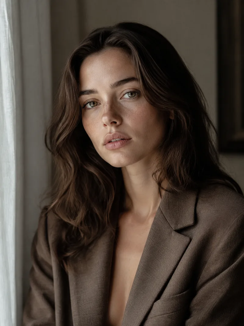
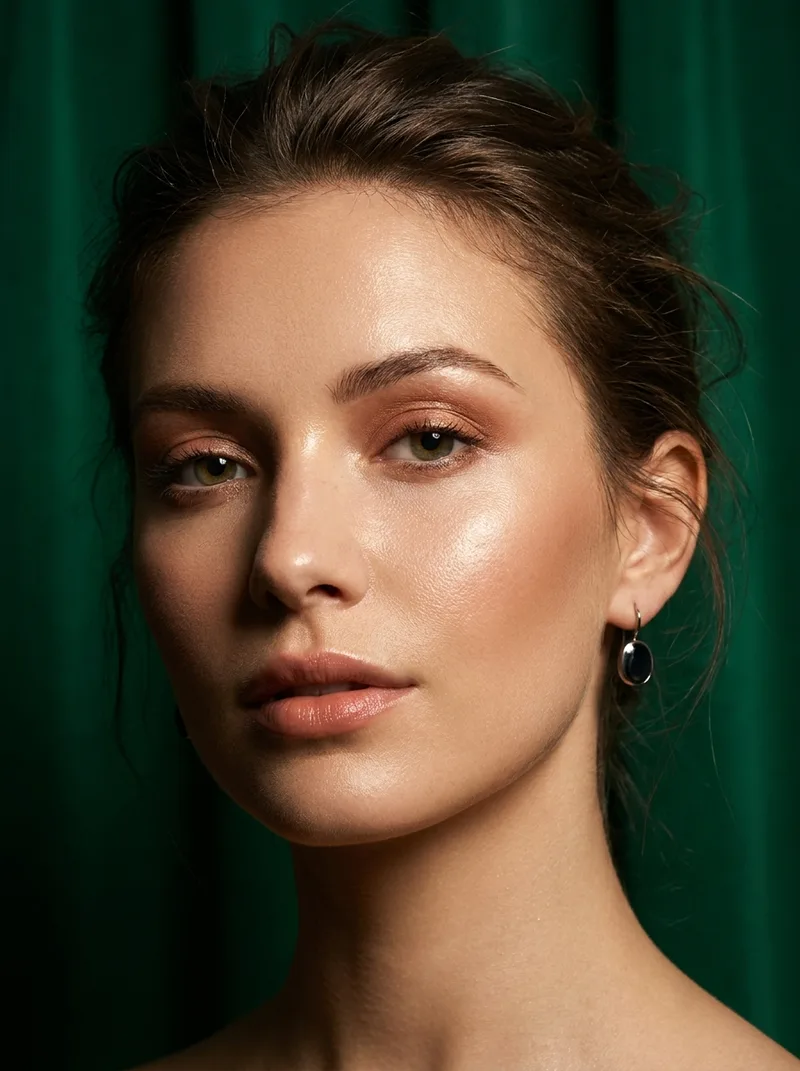
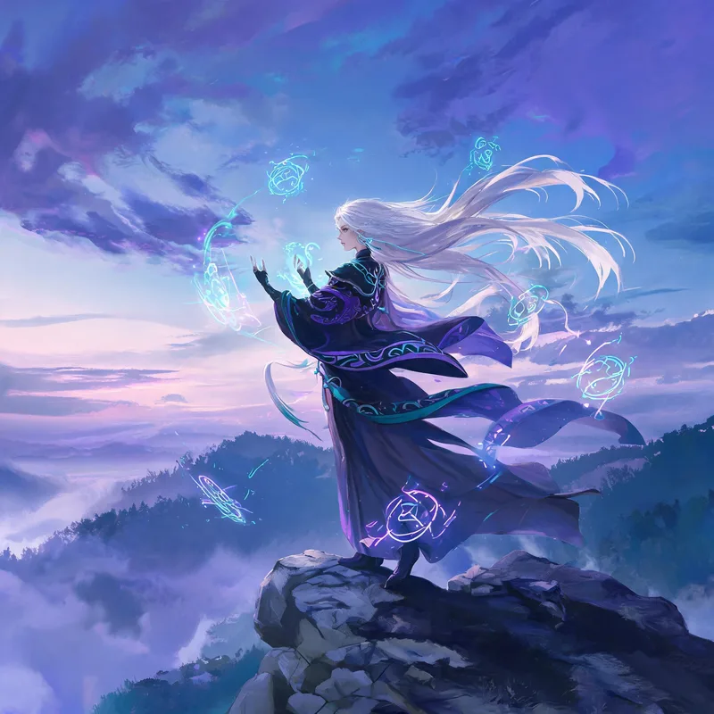
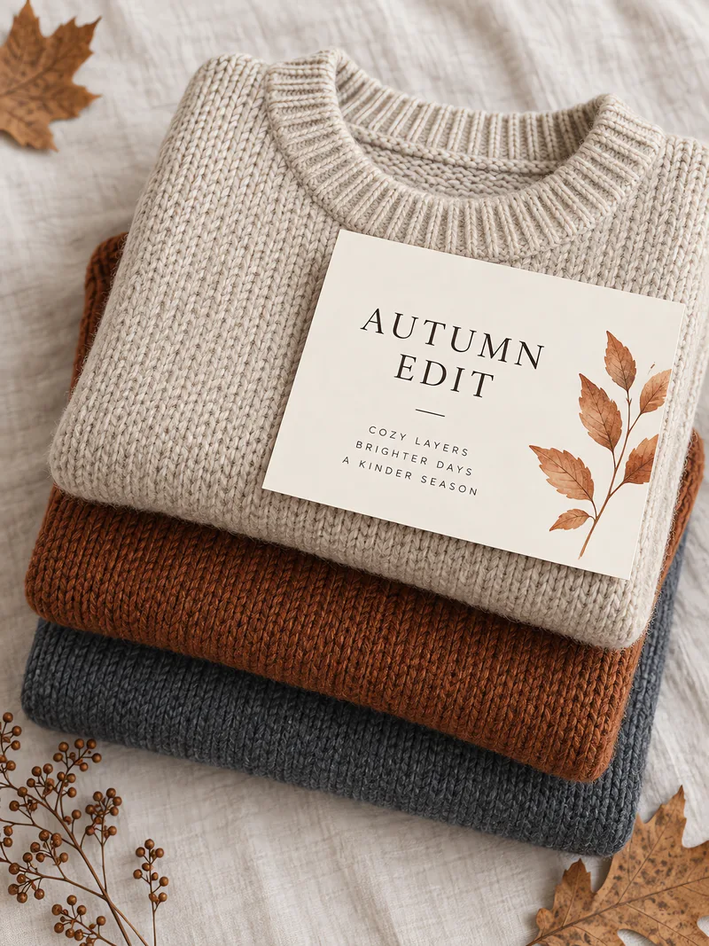
"A poster reading "[exact text]" in [font style], smaller line below reading "[subtitle]". [Paper and ink colours]. The text must be sharp and perfectly legible."
两行文案都用引号写出来。"sharp and perfectly legible" 这句,是干净渲染和糊成一团之间的分界。
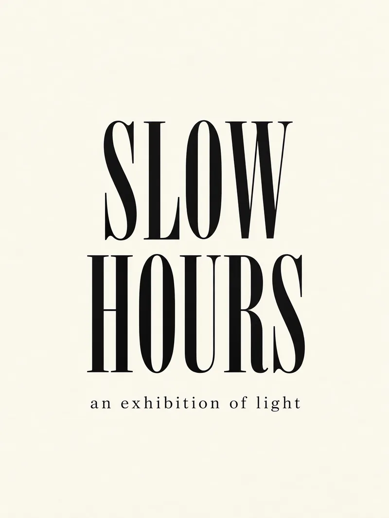
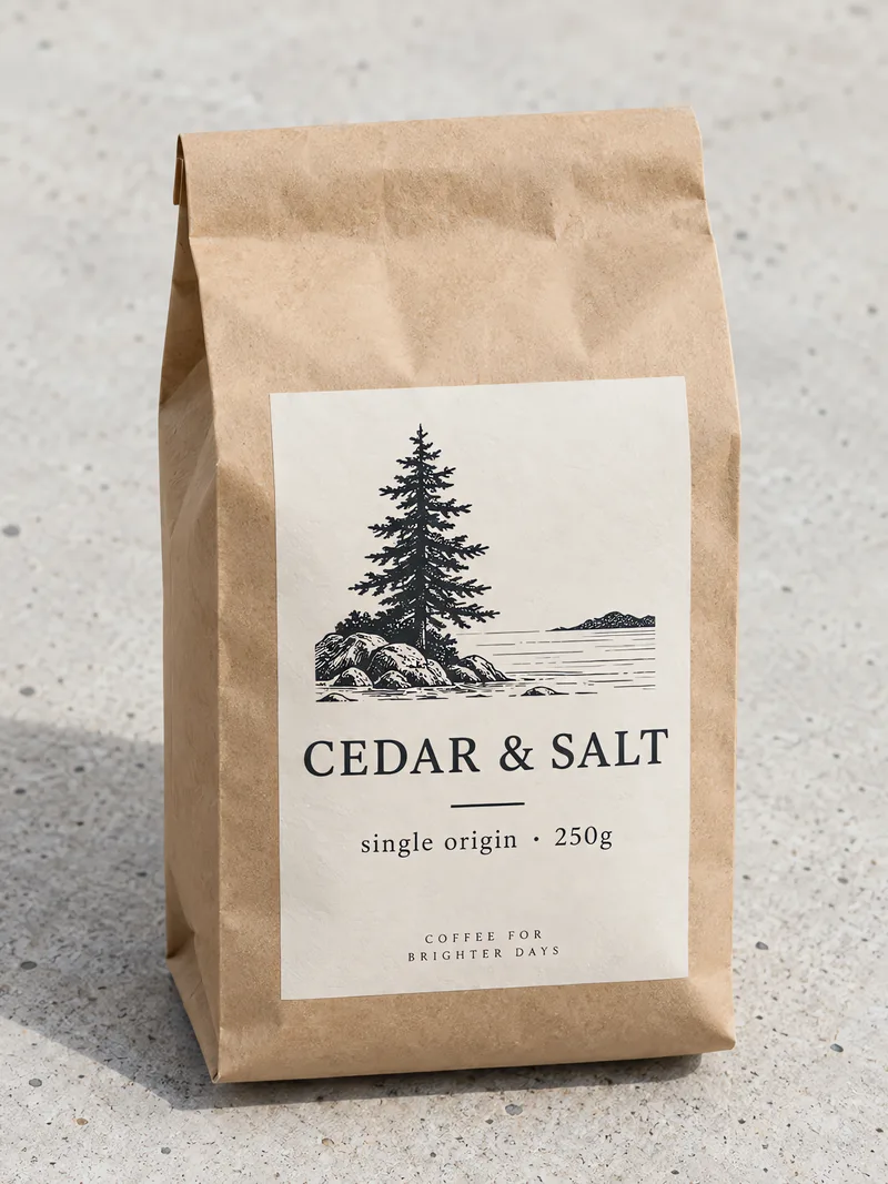
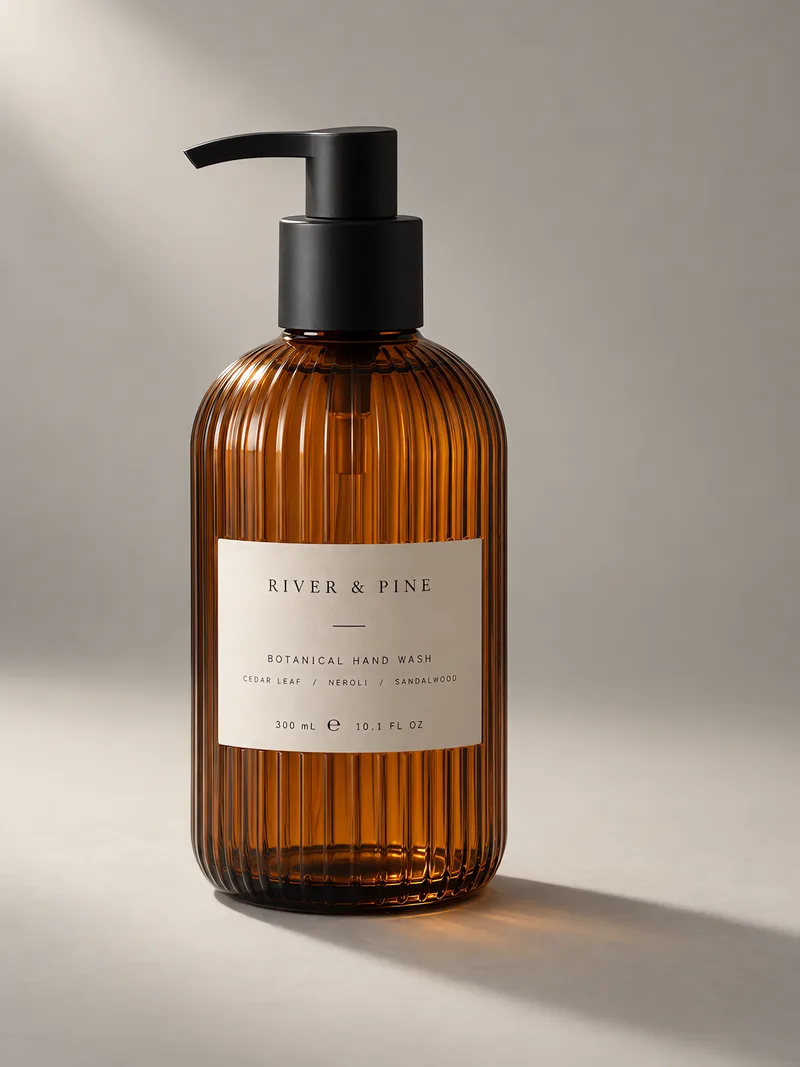
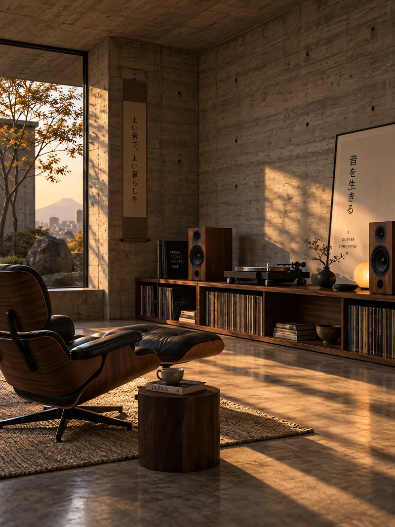
"A poster reading "[exact text]" in [font style], smaller line below reading "[subtitle]". [Paper and ink colours]. The text must be sharp and perfectly legible."
两行文案都用引号写出来。"sharp and perfectly legible" 这句,是干净渲染和糊成一团之间的分界。
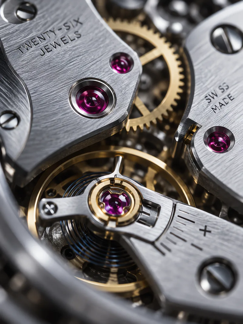
"A [package type] on [surface], printed label reading "[brand]" with smaller text "[details]" beneath, [light description]. Text must be crisp and readable."
包装上同时有两级字号。把品牌名、小字、承载面和光位一起写清楚,小字那一行才立得住。
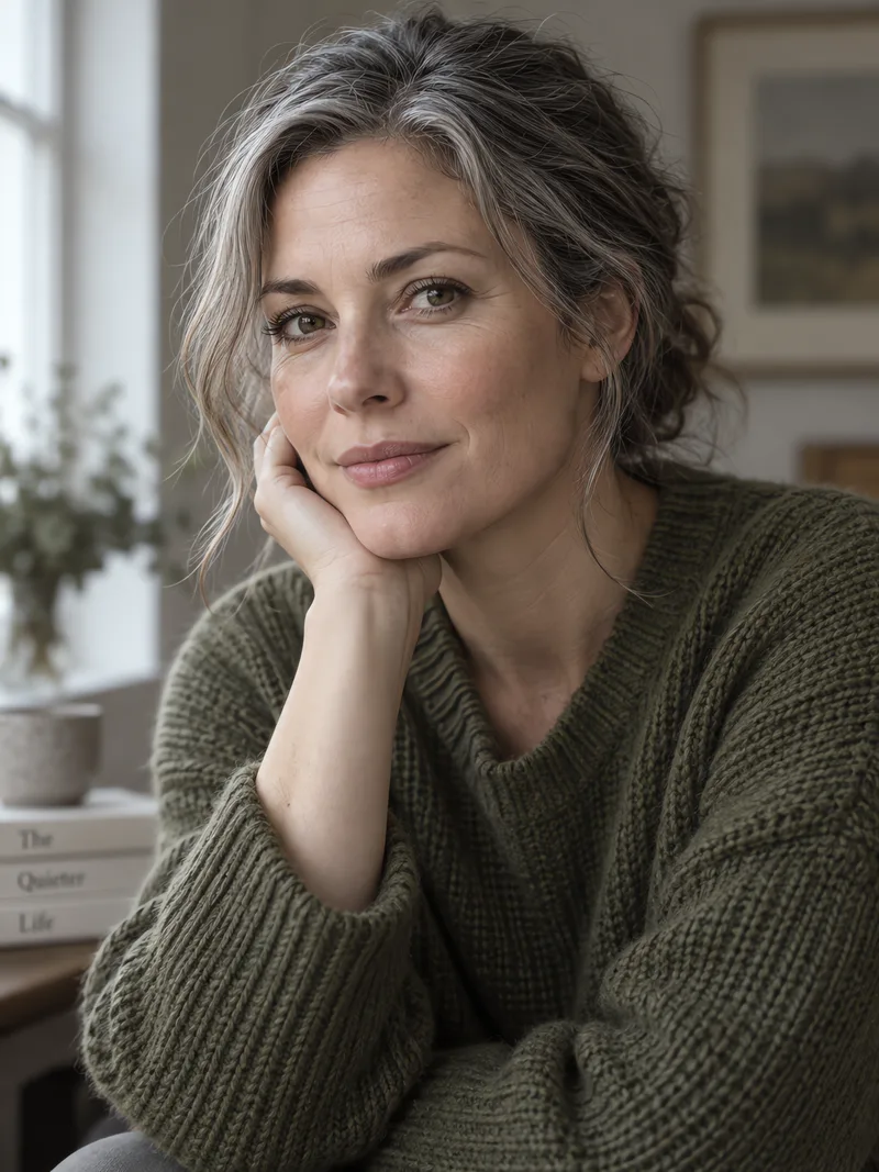
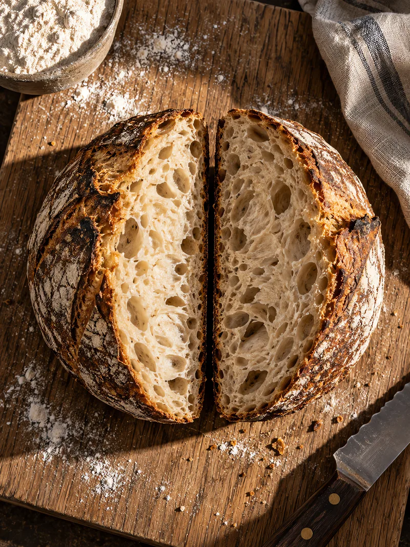
"[Subject and scene], [light direction], shallow depth of field. — then set Resolution to 4K with a 3:4 or 9:16 ratio."
选它而不选 GPT Image 2 的理由:它的 4K 档在竖构图下真的生效,而 GPT Image 2 会悄悄降到 2K。
两个方向的差别。它在任意比例下都能渲染 4K,而 GPT Image 2 把 4K 限制在六种横版比例,其余一律降到 2K——所以竖版 4K 只有这里有。代价是少了 2:1、1:2、9:21 三种比例,也不接受像素尺寸,因此蒙版重绘和扩展画布仍然走 GPT Image 2。
两者的上游成本完全一样。GPT Image 2 的定价当初被刻意抬高过,用来把自动路由引向它;这个模型按标准基准定价。
当提示词的意图正好落在 GPT Image 2.5 的强项上,且在同等画质门槛的候选里它成本更低时。
可以。任意对话里的模型选择器都能按单轮或整段会话固定,也可以在 /settings 里设为默认。