制作の過程
Stillwater
このリプレイについて
Stillwater is a fictional meditation app, and this session produces four mobile screens as a UI showcase. The unusual instruction is procedural: each screen must be an independent image generated with GPT Image 2, with no image-to-image or source-image chaining, so the design system travels through the text description only. That system is a dawn-to-dusk gradient palette of lavender, peach and deep teal, generous whitespace, large rounded cards, a clean sans-serif, soft shadows, an iOS-native feel and minimal text. Each screen sits inside a modern phone mockup on a soft gradient backdrop, 9:16 portrait.
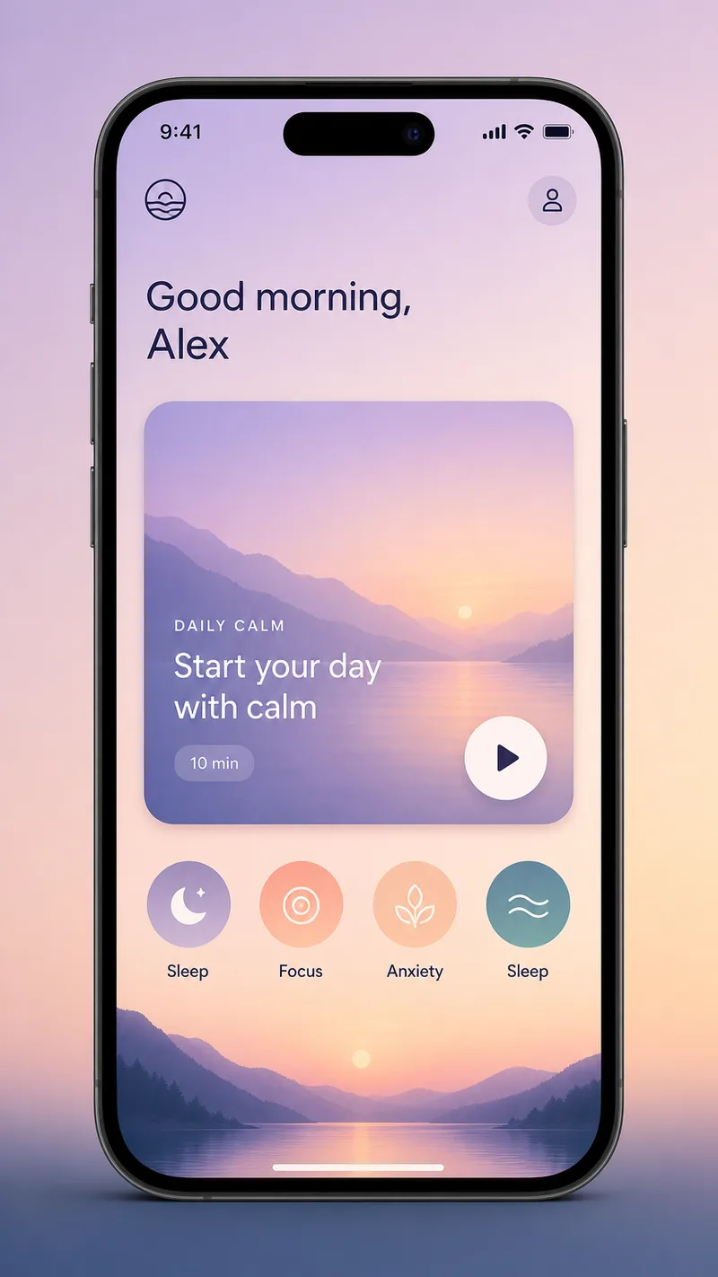
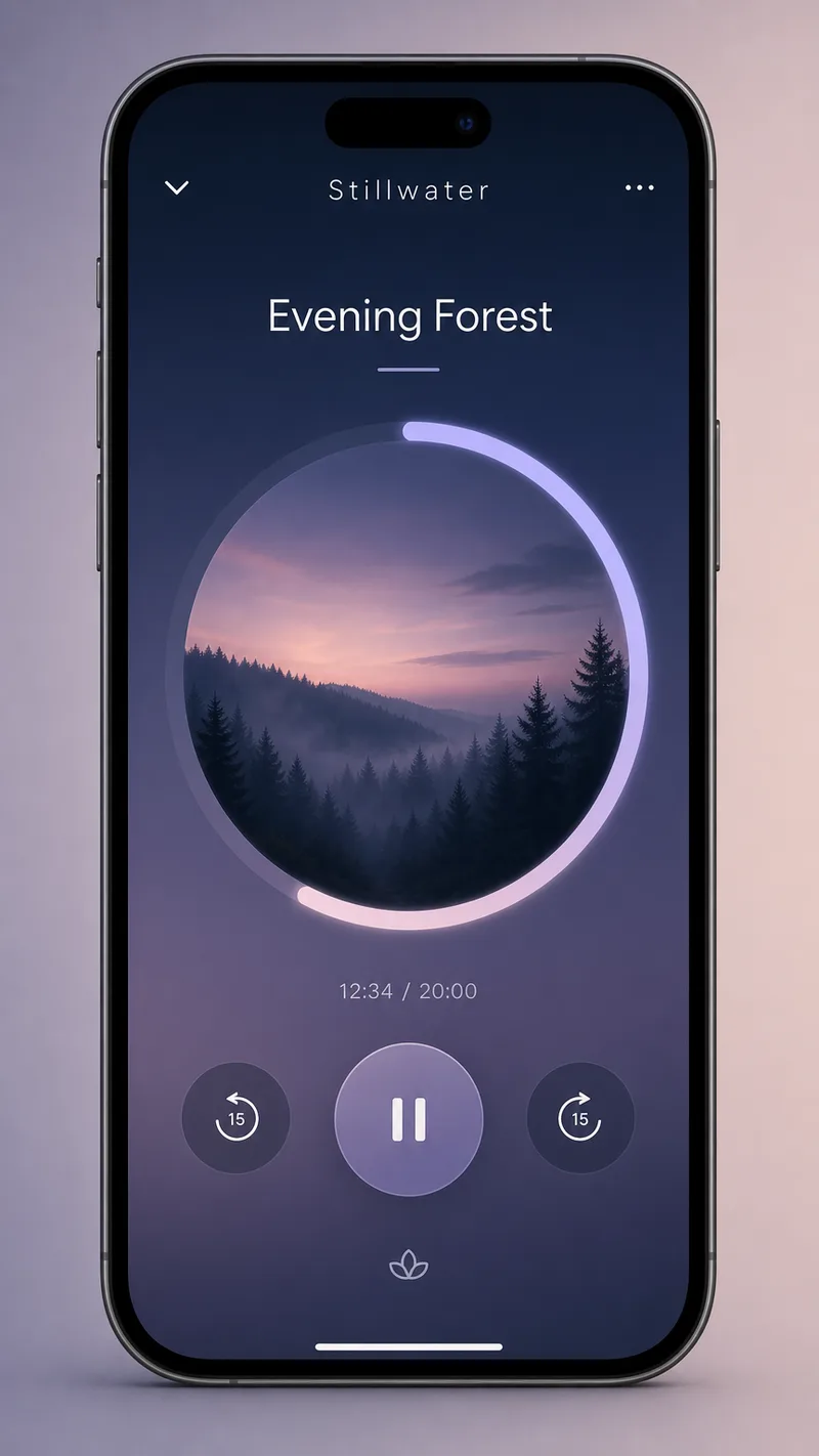
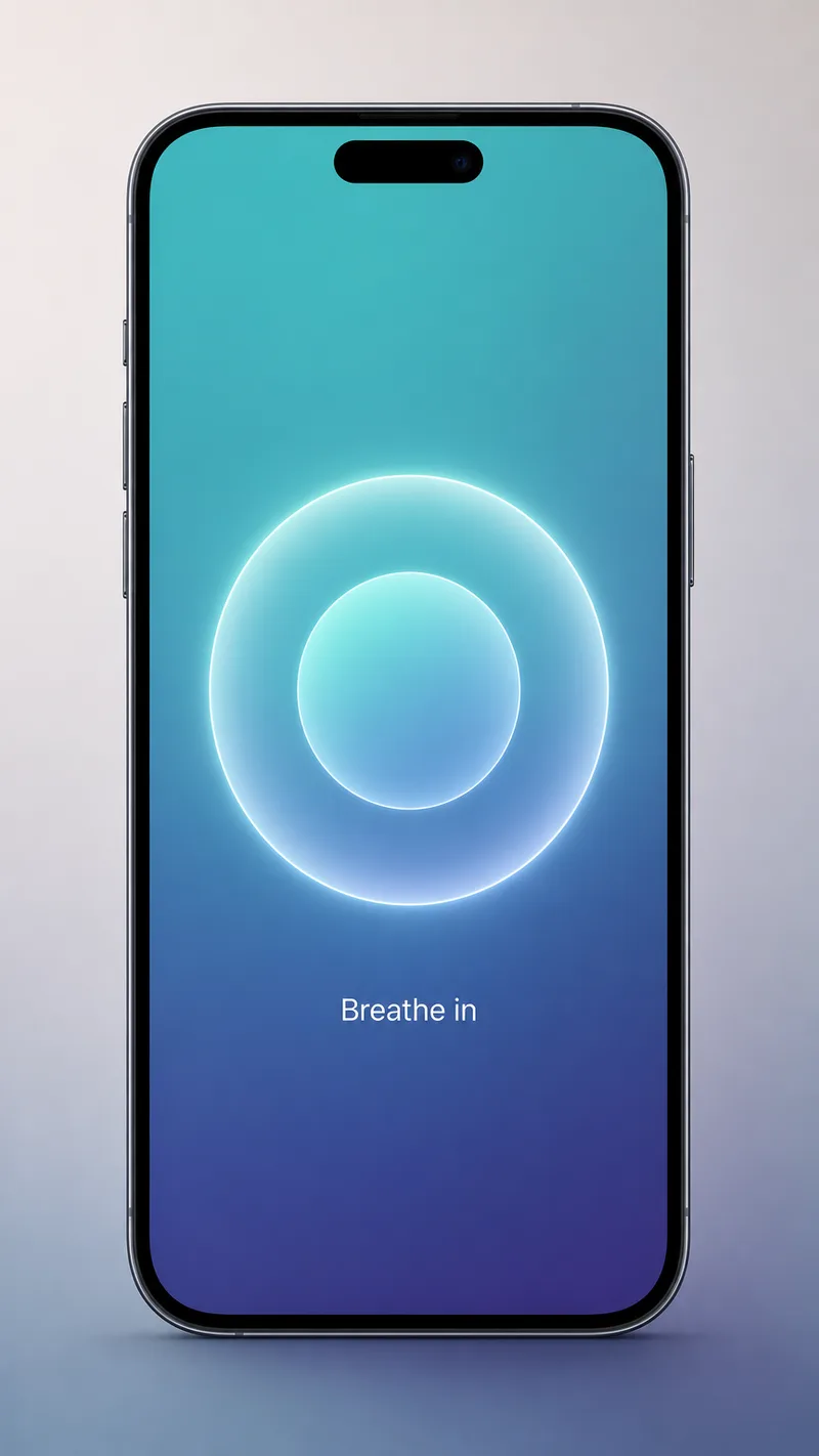
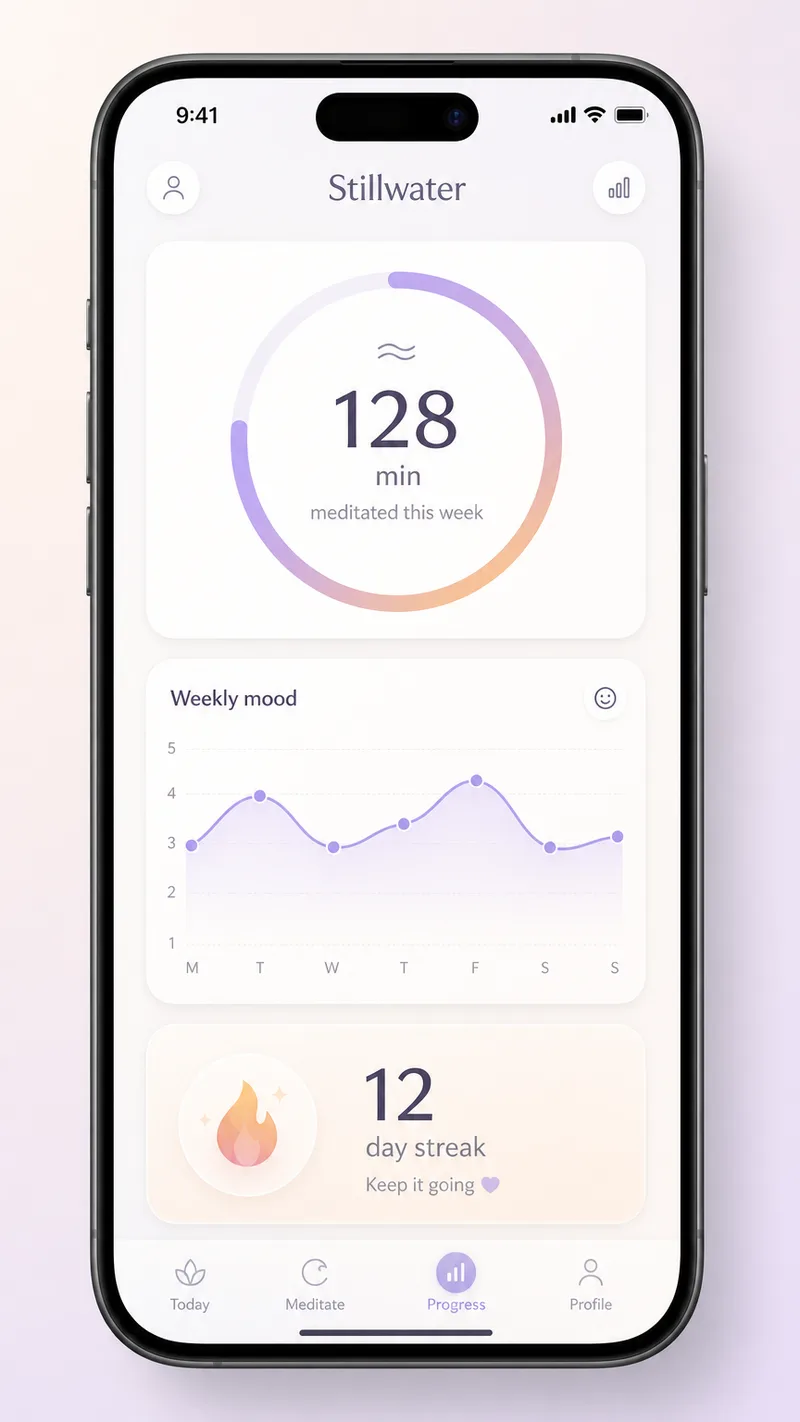
The four screens are specified by component. Today has a short greeting, a featured Daily Calm card with a play button and a row of round category chips. Session Player has a circular progress ring around a misty forest thumbnail and minimal controls. Breathe is a single glowing concentric circle with a short label. Progress has a minutes ring, a weekly mood line chart and a streak count.
The agent made one parallel call and got four 864x1536 images, matching the 9:16 request. Its summary describes each screen and says the rounded-card style and typography hold across all four. Because generators often struggle with small interface text, the lack of any lettering check or edit pass means the on-screen labels deserve a look on the page. The agent offered a single-screen refinement or a 2x2 grid export.
Tip: when you want consistency without chaining, put the design tokens (palette, radius, shadow, type style) in one shared paragraph, then give each screen a component list. Say explicitly that text should stay minimal.
依頼内容
Create a 4-screen mobile app UI showcase for a premium meditation and wellness app called Stillwater. Generate each of the four screens as an INDEPENDENT image with gpt-image-2 - do NOT use image-to-image or source_image chaining; the screens share a design system through this description, not by referencing each other. ONE cohesive design system across all four: soft dawn-to-dusk gradient palette (calm lavender, peach, deep teal), generous whitespace, large rounded cards, a clean modern sans-serif, soft shadows, premium iOS-native feel, MINIMAL text (lean on the visuals, keep labels short). Each screen shown inside a clean modern phone mockup with a subtle device frame, centered on a soft neutral gradient backdrop. Portrait 9:16 for every frame. Screen 1, Today: a calm home screen - a short warm greeting at top, a large featured Daily Calm session card with a soft gradient and a small play button, a row of round category chips, a gentle dawn gradient background. Screen 2, Session Player: a meditation now-playing screen - a large soft circular progress ring around a serene misty-forest thumbnail, minimal play and pause controls below, a short session title, deep dusk gradient. Screen 3, Breathe: a breathing-exercise screen - one large softly glowing concentric breathing circle centered, a short Breathe in label, calm teal-to-indigo gradient, very minimal. Screen 4, Progress: a serene stats screen - a small ring showing minutes meditated, a gentle weekly mood line chart, a streak count, soft rounded cards on a light background. Generate all four.
エージェントがしたこと
I'll generate four independent screens for the Stillwater app, each with a cohesive design system. Let me create them all in parallel.
画像を 4 枚生成 · GPT Image 2
All four Stillwater screens are ready. Here's what was created:
Screen 1 — Today: A warm home screen with a soft lavender-to-peach dawn gradient, a featured Daily Calm card with a play button, and a tidy row of round category chips. The greeting feels personal and unhurried.
Screen 2 — Session Player: A dusk-toned now-playing screen with a large circular progress ring around a misty forest thumbnail, minimal play controls, and the session title floating quietly above. Deep teal and indigo set a calm evening mood.
Screen 3 — Breathe: The most stripped-back of the four — a single large glowing concentric breathing circle on a teal-to-indigo gradient, with just a "Breathe in" label. Designed to reduce cognitive load during the exercise.
Screen 4 — Progress: A light, airy stats screen with a minutes ring, a gentle mood line chart, and a streak card — all wrapped in soft rounded cards with generous spacing.
The shared design language holds across all four: the same rounded-card DNA, soft shadow system, and restrained typography. If you'd like, I can refine any single screen — adjust a gradient, add a component, or tighten the layout — or export them as a 2x2 grid for a portfolio presentation.
成果物