Como foi feito
Brush script logo
Sobre este replay
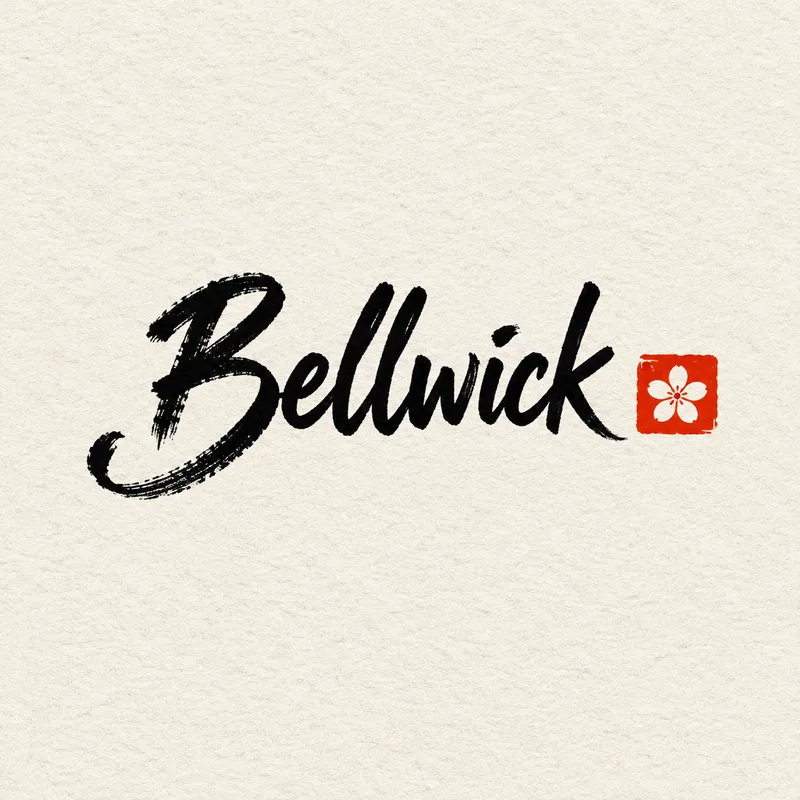
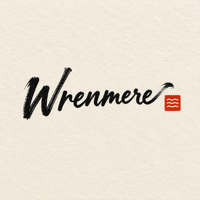
Two square logo presentation boards, one per turn, for invented brands: Wrenmere, a lakeside coffee shop, and Bellwick, a neighbourhood florist. Both briefs ask for the name hand-lettered in a loose, connected brush script with dry-brush texture, pressure changes and one expressive swash, plus a small red square stamp with a wordless abstract motif. Everything sits on warm white textured paper in black ink, centred with generous margins. For Wrenmere the swash runs out of the final e like a wave and the stamp shows three ripple lines; for Bellwick the swash curls from the capital B like a stem and the stamp shows a single five-petal flower.
The agent loaded the logo-design skill first, then generated each board in one pass with GPT Image 2.5 at 1024 by 1024. There was no correction round: each turn produced one image, described as matching the brief. The agent did not report a separate spelling check of either name, so read the lettering carefully yourself.
After the Wrenmere board the agent offered the stamp on its own as a small icon, a one-colour horizontal lockup, or the mark on a dark coffee-brown background for cup sleeves and signage. After the Bellwick board it offered the flower stamp as a standalone icon for signage and stickers, or the full lockup reversed out on deep green or kraft-brown for packaging.
A useful tip from the briefs: they state the exact spelling of the name, list what must not appear (no tagline, no registered or trademark symbols, no other words), and say the mark must not resemble any real company's logo. They also separate the elements by role: the wordmark carries the character, the stamp is small and wordless. Describing the brush qualities in physical terms, such as dry edges, pressure changes and a single swash, gives the generator concrete marks to draw.
O pedido
Create a finished square 1:1 logo presentation board for Wrenmere, a lakeside specialty coffee shop. The brand name "Wrenmere", spelled exactly, hand-lettered with a brush in a loose, confident connected script, fully legible, with visible dry-brush texture, pressure changes and one expressive swash extending from the final e like a wave. Beside it a small square red stamp with a simple abstract motif of three ripple lines, no letters. Black ink on warm white textured paper with a faint fibre texture, centred, generous margin. The brand is invented and the mark must not resemble any real company's logo. No other words, no tagline, no ® or ™.
O que o agente fez
I'll load the logo design guidance first, then build the board.
Carregou a habilidade “Logo design” — Iterate logos, marks, and full lockup variations on the canvas.
One square board, built as a hand-lettered ink wordmark on warm paper. Generating now.
Gerou uma imagem · GPT Image 2.5
Here's the finished square board: the "Wrenmere" wordmark hand-lettered in black brush script with dry-brush edges and one wave-like swash off the final e, paired with the small red ripple stamp, centred on warm fibre paper with wide margins.
Two natural next steps: I can build the lockups from this same mark — stamp alone for a small icon, and a one-colour horizontal version — or show it on a dark/coffee-brown background for cup sleeves and signage.
Resultados
Pedido seguinte 1
Create a finished square 1:1 logo presentation board for Bellwick, a neighbourhood florist. The brand name "Bellwick", spelled exactly, hand-lettered with a brush in a loose, confident connected script, fully legible, with visible dry-brush texture, pressure changes and one expressive swash from the capital B curling like a stem. Beside it a small square red stamp with a simple abstract motif of a single five-petal flower, no letters. Black ink on warm white textured paper with a faint fibre texture, centred, generous margin. The brand is invented and the mark must not resemble any real company's logo. No other words, no tagline, no ® or ™.
O que o agente fez
Same presentation system as the Wrenmere board, new mark. Generating the Bellwick board.
Gerou uma imagem · GPT Image 2.5
Bellwick board is done — the brush-script wordmark in black ink with a stem-like swash curling off the B, the small red five-petal flower stamp beside it, all centred on warm fibre paper with wide margins, matching the Wrenmere board's presentation.
Next I could cut the flower stamp out as a standalone icon for shop signage and stickers, or set the full lockup reversed out on a deep green or kraft-brown for packaging.
Resultados