How this was made
Swiss poster
About this replay
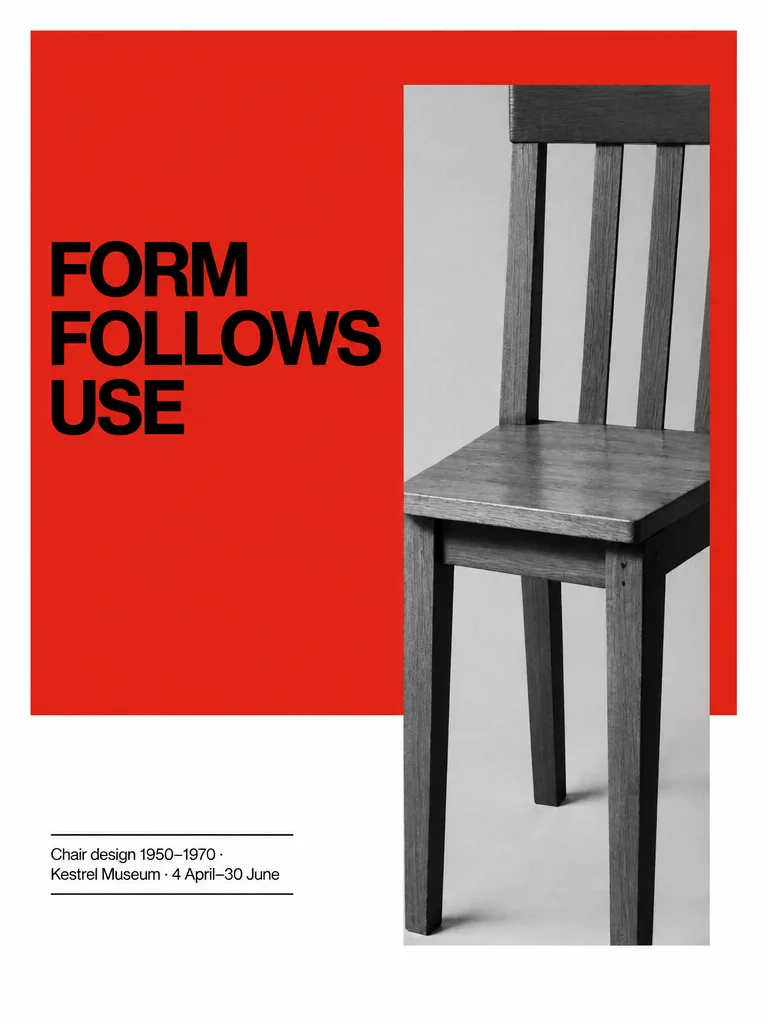
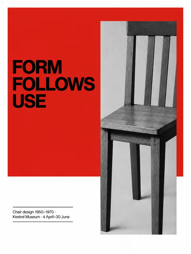
International Typographic Style posters are the focus of this two-poster session, both portrait 3:4, on a strict grid with wide margins and everything set flush left. The first pairs a black-and-white photo of a plain wooden kitchen chair, cropped into a tall rectangle in the right half, with a large flat signal-red field across the upper two thirds. The title FORM / FOLLOWS / USE is set very large in a heavy neo-grotesque, one word per line, and a small caption between two thin rules sits in a narrow column at the lower left.
The agent loaded the poster-design skill, generated the poster with GPT Image 2.5, and then checked the result. It reported that the text was exact but that the red field stopped at about half the height instead of two thirds. It ran an edit pass to extend the red on the grid while holding the type still, and the final message says the red now runs the full upper two thirds.
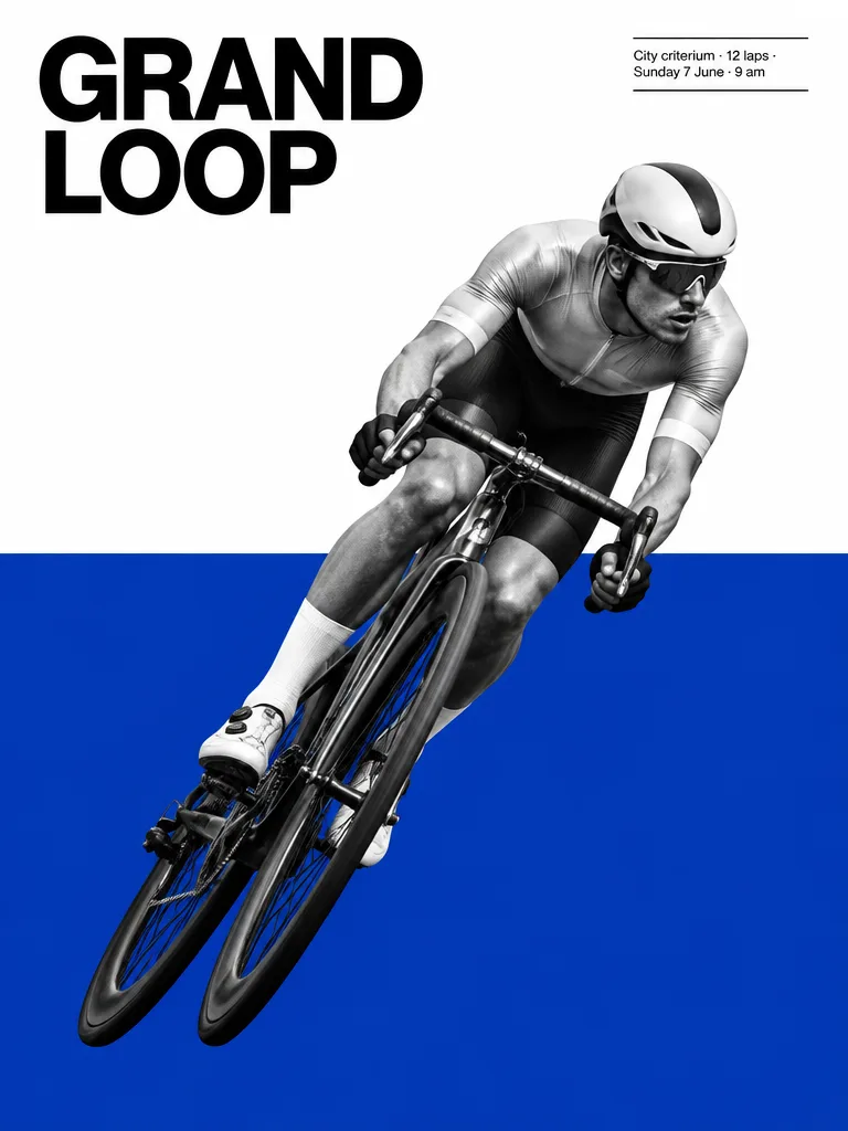
The second poster is a follow-up with a cyclist leaning into a bend, cut out and placed diagonally across a flat cobalt-blue field in the lower half. The title GRAND / LOOP is on two lines at top left, and a small boxed caption sits at the upper right. This one was a single generation. The agent says both text blocks read exactly as given, but it also admits one thing came out differently from the brief: the cyclist runs on the opposite diagonal, head toward the top right. It offered to mirror the image.
The tip is to state proportions in plain fractions, such as two thirds, because they can be checked afterward and corrected with a targeted edit pass instead of regenerating the whole sheet.
The request
Create one finished portrait 3:4 poster in the International Typographic Style on a strict grid with wide margins, everything flush left. A black-and-white photograph of a plain, generic wooden kitchen chair with four straight legs, a flat seat and three simple vertical back slats, an anonymous everyday design that no one would recognise as a famous designer piece, cropped hard into a tall rectangle in the right half of the frame, against a large flat signal-red field filling the upper two thirds; the rest white. The title in a heavy neo-grotesque, very large, tight tracking, ranged left and broken over three lines, exactly "FORM / FOLLOWS / USE" (one word per line, no slashes). In a narrow column aligned to the grid at the lower left, small regular grotesque between two thin black rules, exactly "Chair design 1950–1970 · Kestrel Museum · 4 April–30 June". Spell every word exactly as given. The quoted text is the only writing anywhere: no other words, numbers, logos, signatures or ™/® symbols. All names and places of business are invented; any people are invented, not real or famous.
What the agent did
I'll load the poster design guidance, then build the poster.
Loaded the Poster design skill — Event posters and key visuals with strong hierarchy and type.
Generated an image ·
Text is exact; the red field stopped at about half height rather than two thirds. Extending it on the grid while holding the type still.
Edited an image ·
Done — one finished 3:4 poster, corrected so the signal-red field runs the full upper two thirds with the white third below.
The direction I asked for: strict wide-margin grid, everything flush left; a heavy neo-grotesque title set very large and tight over three lines in the left column; a hard-cropped black-and-white chair photograph — plain wooden, four straight legs, three back slats, deliberately anonymous — slicing down the right half through the red and into the white; and a small narrow-measure caption between two hairline rules at the lower left. Both text blocks came back spelled exactly as given, and the red is a single flat, untextured ink.
If you want to push it further: I can try a variant where the chair is cut by the poster's right edge instead of sitting inside it, or run a 2:3 print version on the same grid.
Outputs
Follow-up 1
Create one finished portrait 3:4 poster in the International Typographic Style on a strict grid with wide margins, everything flush left. A black-and-white photograph of a racing cyclist leaning into a bend, cut out cleanly, placed diagonally across a large flat cobalt-blue field in the lower half; the rest white with black type. The title in a heavy neo-grotesque, very large, tight tracking, ranged left and broken over two lines, exactly "GRAND / LOOP" (one word per line, no slash). In a narrow column aligned to the grid at the upper right, small regular grotesque between two thin black rules, exactly "City criterium · 12 laps · Sunday 7 June · 9 am". Spell every word exactly as given. The quoted text is the only writing anywhere: no other words, numbers, logos, signatures or ™/® symbols. All names and places of business are invented; any people are invented, not real or famous.
What the agent did
Generated an image ·
Done — one finished 3:4 poster.
The direction I asked for: a strict wide-margin grid with everything ranged flush left; the flat cobalt field forming a hard horizon across the lower half; the cut-out cyclist dropped across it as a single high-contrast photographic element leaning at a steep diagonal, breaking above the blue edge into white; the title in a heavy neo-grotesque, very large and tight, two lines at the top left; and the small narrow-measure caption boxed by two hairlines at the upper right. Checked after generation: both text blocks read exactly as given, nothing else is written on it, and the blue is a single untextured ink.
The one thing that came out differently from my brief: the cyclist runs on the opposite diagonal — head at the top right, front wheel down into the lower left — which actually pushes against the left-to-right reading and makes the lean feel faster. If you'd prefer it mirrored to run with the type instead, I can flip it and keep everything else in place.
Outputs