How this was made
Event poster
About this replay
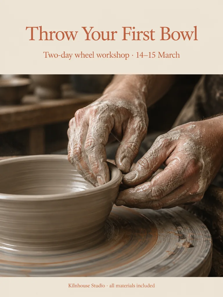
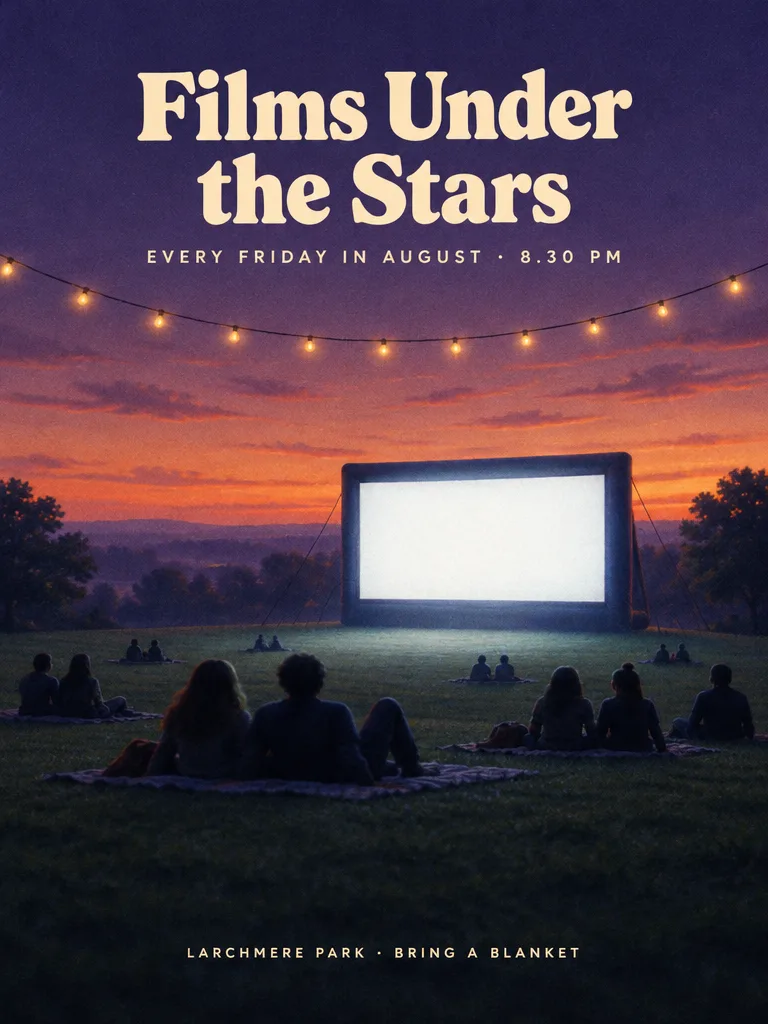
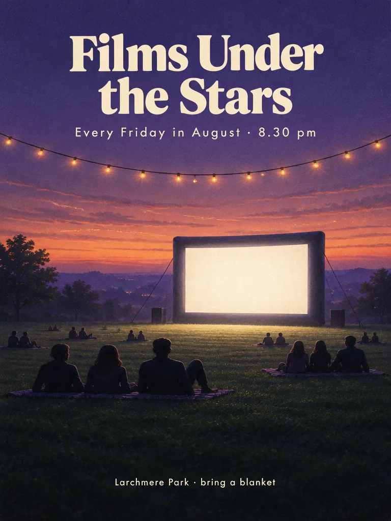
Two portrait 3:4 event posters with a clear three-level hierarchy of title, detail line and location line. The first is for an open-air cinema night: a grassy park at dusk, a glowing inflatable screen, people on blankets as soft silhouettes, string lights and a violet-and-amber sky, with a cream retro serif title. The second is for a weekend pottery workshop: a close-up of clay-covered hands shaping a bowl on a wheel, a pale clay and terracotta palette and generous cream space above for a terracotta serif title.
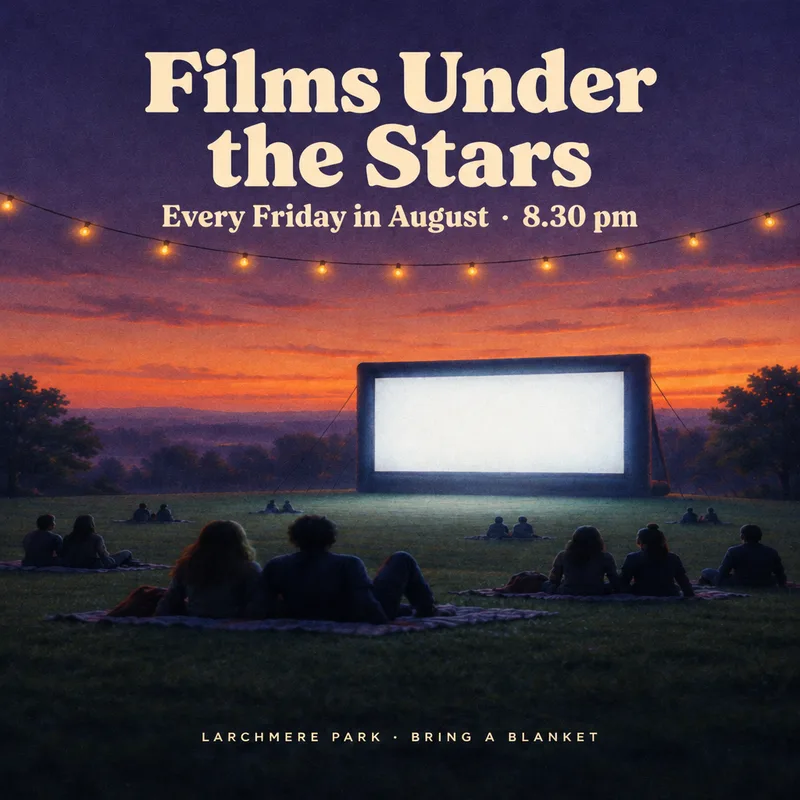
On the cinema poster the agent loaded the poster-design skill, generated with GPT Image 2.5, then checked the lettering and stray marks. It found the two small lines had come out in all capitals rather than the case given, and it tried an edit pass. That edit returned a square canvas and lost the 3:4 format, so the agent re-rendered the whole poster at 3:4 with the correct casing in the brief from the start, and reported all three lines spelled and cased as given.
For the pottery poster, one generation at 768 by 1024 was enough. The agent described a cream field across the top for the type, the wheel photo bleeding through the middle and a narrow cream band at the foot. It reported that all three lines were exact, including the middle dots and the en dash in the date.
Tip from this session: if a small line needs particular letter case, say so in the prompt and check it, since an edit pass can change the image shape. The pottery brief's reserved plain cream area above the photo is one way to give the title room.
The request
Create one finished portrait 3:4 event poster for an open-air cinema night. A wide grassy park at dusk, a large inflatable screen glowing white, people on blankets as soft silhouettes, string lights overhead, a deep violet and amber sky. Clear hierarchy: the exact title "Films Under the Stars" large in a bold retro serif in warm cream at the top; below it, smaller, exactly "Every Friday in August · 8.30 pm"; at the bottom, exactly "Larchmere Park · bring a blanket". Atmospheric and inviting. Spell every word exactly as given. The quoted text is the only writing anywhere: no other words, numbers, logos, watermarks or ™/® symbols. All brands and names are invented and nothing may resemble a real company's logo; any people are invented, not real or famous.
What the agent did
I'll load the poster design skill first, then build the poster.
Loaded the Poster design skill — Event posters and key visuals with strong hierarchy and type.
Designing it around one moment: the instant the projector warms up and the screen becomes the brightest thing in a still-violet park. Here's the poster.
Generated an image ·
Let me verify the exact lettering and check for any stray marks before I consider it finished.
No stray marks, but the two small lines came out in all caps — I'll set them in the exact case you gave.
Edited an image
That edit returned a square canvas and lost the 3:4 format, so I'll re-render the poster at 3:4 with the casing correct from the start.
Outputs
Follow-up 1
Create one finished portrait 3:4 event poster for a weekend pottery workshop. A close-up photo of clay-covered hands shaping a bowl on a wheel, warm studio light, a pale clay and terracotta palette, generous plain cream space above. Clear hierarchy: the exact title "Throw Your First Bowl" large in a clean modern serif in terracotta; below it, smaller, exactly "Two-day wheel workshop · 14–15 March"; at the bottom, exactly "Kilnhouse Studio · all materials included". Calm and crafted. Spell every word exactly as given. The quoted text is the only writing anywhere: no other words, numbers, logos, watermarks or ™/® symbols. All brands and names are invented and nothing may resemble a real company's logo; any people are invented, not real or famous.
What the agent did
Building it as a clean editorial split: cream space for the type above, the wheel close-up below.
Generated an image ·
That's the poster — 3:4, on the canvas.
Direction: the design leans on the print-card structure rather than a full-bleed image: a plain cream field at the top (about 38%) holds the type so it reads like letterpress on stock, the wheel close-up bleeds edge to edge through the middle, and a narrow cream band at the foot carries the studio line — a quiet frame around the making. The photograph is shot tight and slightly from above, hands and wet clay filling the frame, with the terracotta slip and the putty-grey body of the clay doing all the colour work against the cream. One warm source from the upper left, shallow focus, dusty air, so the whole thing feels like a studio at 4pm rather than a stock product shot.
Type: "Throw Your First Bowl" in terracotta, single line and large; the date line smaller beneath it; the studio line in the footer band. I checked the lettering — all three lines are exact, with the middle dots and the en dash in the date as you wrote them, and no other marks anywhere in the frame.