How this was made
Bakery identity
About this replay
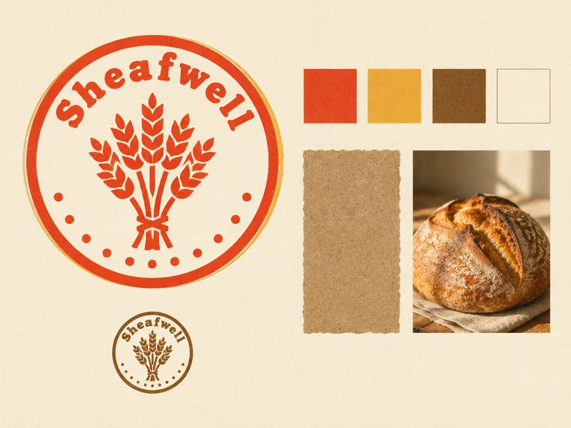
A two-image identity system for an invented neighbourhood bakery, Sheafwell, in a warm retro print style. The first request was a landscape 4:3 identity board: a round wheat-sheaf stamp in one ink with the name in a bold, soft, rounded display serif, shown large on the left, beside four plain colour chips, one small kraft paper sample and one small photograph of a crusty loaf. The brief gave four hex colours (tomato red, wheat yellow, crust brown and flour white) but forbade writing any codes on the board, and made the name inside the mark the only text allowed.
The agent loaded the brand-visuals skill, restated the art direction as a risograph-flat print with grain and slight misregistration, and generated the board with GPT Image 2.5 at 1024 by 768. It described the result with the stamp in red with a yellow off-register pass, and offered to check the board for stray lettering, though it did not report running that check.
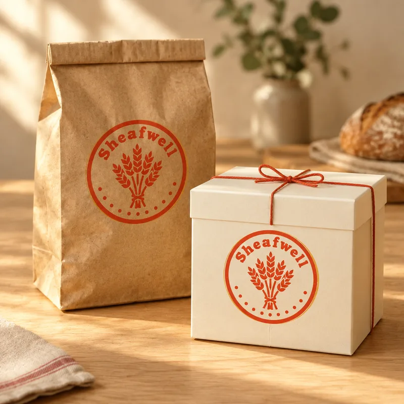
The second turn asked for a square 1:1 packaging shot, a kraft bread bag and a white cake box tied with red string on a wooden counter, with the exact mark printed on both. The brief attached the first board and said to reproduce the mark exactly and never redraw it. The agent looked closely at the mark first, then generated the image from the board at 1024 by 1024, so the mark carried over from the reference.
Tip: when building a system, give the second image the first image as a reference and say in plain words that the mark must be reproduced, not redrawn. Keeping the palette in hex in the brief but banning codes from the artwork avoids stray numbers.
The request
Brand system: Sheafwell, a neighbourhood bakery, warm retro print. Mark: a simple round wheat-sheaf stamp in one ink with the name "Sheafwell" set in a bold, soft, slightly rounded retro display serif. It must not resemble any real company's logo. Palette: tomato red #D9472B, wheat yellow #E9B949, crust brown #8A5A2B, flour white #FAF3E3. Type: the name only in the mark's lettering; any extra copy in the same bold retro display serif. Materials and imagery: risograph-style flat print with slight grain and misregistration, kraft paper bags, butter paper, golden crusts; warm morning light for photographs. Identity board, landscape 4:3: design the mark and show it large on the left; beside it a row of four plain colour chips in the palette with no codes written, one small kraft paper material sample and one small photograph of a crusty loaf. The only writing is "Sheafwell" inside the mark. No other text, no numbers, no colour codes, no ® or ™. No people.
What the agent did
I'll read the brand-visuals skill first, since this is a coordinated identity board built from one brief.
Loaded the Brand visuals skill — A coordinated visual set — hero, lifestyle, poster, billboard, social, detail — from one product.
Art direction: risograph-flat warm retro print — tomato red #D9472B and wheat yellow #E9B949 on flour white #FAF3E3 kraft, crust brown #8A5A2B for depth, one-ink stamp mark, visible paper grain and slight misregistration, soft morning warmth.
I'll design the mark and the board in one composite.
Generated an image ·
The identity board is on the canvas: the round wheat-sheaf stamp set large on the left in tomato red with a soft yellow off-register pass, the name arced in bold rounded retro display serif, a small crust-brown stamp below, and on the right the four plain chips, a kraft paper sample and a warm morning-light shot of a crusty loaf — all on flour white with riso grain.
Next steps I can take: build the mark out as a standalone logo file at any ratio (and a single-ink version for stamping bags), or extend the system into kraft bag and butter-paper mockups. I can also check the board for stray lettering if you want.
Outputs
Follow-up 1
Brand system: Sheafwell, a neighbourhood bakery, warm retro print. Mark: a simple round wheat-sheaf stamp in one ink with the name "Sheafwell" set in a bold, soft, slightly rounded retro display serif. It must not resemble any real company's logo. Palette: tomato red #D9472B, wheat yellow #E9B949, crust brown #8A5A2B, flour white #FAF3E3. Type: the name only in the mark's lettering; any extra copy in the same bold retro display serif. Materials and imagery: risograph-style flat print with slight grain and misregistration, kraft paper bags, butter paper, golden crusts; warm morning light for photographs. The attached image is the identity board: reproduce its mark exactly, never redraw it. Packaging, square 1:1: a kraft paper bread bag and a white cake box tied with red string on a wooden counter, the exact mark printed on both in tomato red. The only writing is the mark. No other text, no numbers, no ® or ™. No people.
What the agent did
Let me look closely at the mark on the board so the packaging repeats it faithfully.
Reproducing the same stamp on kraft and board in a square packaging frame.
Generated an image ·
The square packaging shot is on the canvas: kraft bread bag and a flour-white cake box tied with red string on a light wooden counter, warm low morning light, the round sheaf stamp printed in tomato red on both — built from the board itself so the mark carries over rather than being redrawn.
Next I can do a butter-paper wrap or a stamped paper bag close-up in the same light, or a 4:5 and 16:9 recomposition of this same set.