How this was made
Night swim poster
About this replay
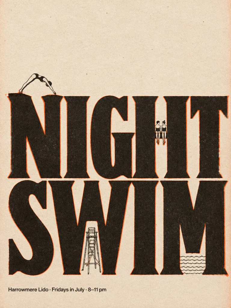
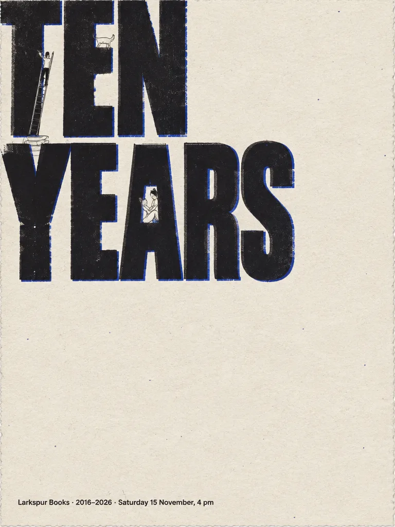
Two limited-colour screenprint posters in portrait 3:4, each built on the same idea: giant condensed lettering acts as a stage, and tiny figures drawn in fine black line live inside and on top of the letters. The first poster, titled TEN YEARS, used ultramarine and warm black on cream paper for a bookshop anniversary, with a reader in the counter of the A, a figure on a ladder against the T, books on the Y and a cat on the E. The second, NIGHT SWIM, swapped the inks to signal orange and warm black and placed a diver on the N, two figures on the H bar, a lifeguard chair in the W and water lines in the M.
The agent loaded the poster-design skill and made one GPT Image 2.5 generation per poster, both at 768 by 1024. After each, it reported checking the typesetting: the title on two lines, the exact footer text in each bottom block, and no other writing. For the second poster it specifically confirmed that all nine letters of the title read, even though the right edge clips the last letter of each line.
The agent was candid about gaps. On the first poster it said the title could be larger to approach half the frame, and that the blue ink could carry more weight. On the second it suggested more orange in the title or a solid chip behind the footer, and an upscale for large-format print.
A tip from the brief: for the second poster the user listed every letter of the title and where each one sits on its line. Spelling out letter order and naming the exact footer wording, with a rule that this is the only writing allowed, makes the output easy to verify.
The request
Create one finished portrait 3:4 poster as a limited two-colour screenprint: exactly two inks, ultramarine and warm black, on cream uncoated paper, with ink grain, flat colour and slight misregistration, no gradients. The title "TEN YEARS" in an ultra-heavy condensed grotesque, two lines, so large that the left and top edges cut the letters and it fills about half the frame. The letters are the stage, drawn in fine black line: a tiny reader sits inside the counter of the A with an open book; a small figure climbs a ladder leaning against the T; a stack of books stands on top of the Y; a cat walks along the top of the E. Leave at least 30% bare paper. In one small plain block on the bottom margin, exactly: "Larkspur Books · 2016–2026 · Saturday 15 November, 4 pm". Spell every word exactly as given. The quoted text is the only writing anywhere: no other words, numbers, logos, signatures or ™/® symbols. All names and places of business are invented; any people are invented, not real or famous.
What the agent did
I'll load the poster guidance first, then build the poster.
Loaded the Poster design skill — Event posters and key visuals with strong hierarchy and type.
Generated an image ·
Your poster is done — a two-colour screenprint on cream uncoated stock.
Direction: the sheet is built on the giant condensed "TEN YEARS" as a typographic stage, cropped hard by the left and top edges, with the drawn line-work living inside the letters — reader with an open book in the A, ladder against the T, books on the Y, cat on the E. Warm-black title with an ultramarine misregistration fringe, flat inks with grain and pinholes, and a wide quiet field of bare cream paper at the right and lower right.
I checked the typesetting: it reads exactly "TEN YEARS" on two lines, and the bottom block is exactly "Larkspur Books · 2016–2026 · Saturday 15 November, 4 pm" — no other text, marks or symbols anywhere.
Two things I'd happily refine:
- Scale: push the title bigger so it reaches closer to half the frame and cuts the letters more aggressively.
- Ultramarine: give the second ink a solid flat plate of its own (an offset shadow plate or a blue footer block) so the two-colour process reads more loudly at a distance.
Outputs
Follow-up 1
Create one finished portrait 3:4 poster as a limited two-colour screenprint: exactly two inks, signal orange and warm black, on cream uncoated paper, with ink grain, flat colour and slight misregistration, no gradients. The title "NIGHT SWIM" in an ultra-heavy condensed wedge-serif face, two lines, so large that it fills about half the frame and the right edge just clips the last letter of each line; all nine letters N, I, G, H, T, S, W, I, M must be present and readable, spelling NIGHT on the first line and SWIM on the second. The letters are the stage, drawn in fine black line: a tiny swimmer dives off the top of the N; two figures dangle their feet from the bar of the H; a lifeguard chair stands inside the W; small wavy water lines fill the bottom of the M. Leave at least 30% bare paper. In one small plain block on the bottom margin, exactly: "Harrowmere Lido · Fridays in July · 8–11 pm". Spell every word exactly as given. The quoted text is the only writing anywhere: no other words, numbers, logos, signatures or ™/® symbols. All names and places of business are invented; any people are invented, not real or famous.
What the agent did
Same press setup, new ink: signal orange and warm black. Generating now.
Generated an image ·
Your NIGHT SWIM poster is printed.
Direction: an ultra-heavy condensed wedge-serif "NIGHT" / "SWIM" set nearly edge to edge in the lower two-thirds, warm black with a signal-orange offset plate showing as misregistration; the T and M clipped by the right trim. The sheet above stays bare cream — the calm, empty night sky the type sits under. Inside the letters: the diver arcing off the N, two foot-danglers on the H bar, the lifeguard chair in the W, and thin water lines pooling in the M.
I checked the setting: all nine letters read correctly as NIGHT / SWIM (the cropped T and M are still clearly identifiable), the bottom block is exactly "Harrowmere Lido · Fridays in July · 8–11 pm", and there is no other writing on the sheet.