How this was made
Custom wordmark
About this replay
Two invented brands, two logo presentation boards, each a square 1:1 image with the brand name as the only writing. Both prompts ask for original custom lettering that is not a stock font, in a single solid ink on a flat warm off-white ground, centred at about 60% of the frame width with generous margin, in flat vector style with no texture, mockup, shadow or gradient. Each also states that the brand is invented and must not resemble a real company's logo, with no tagline and no trademark symbols. The agent loaded the logo-design skill and used GPT Image 2.5.
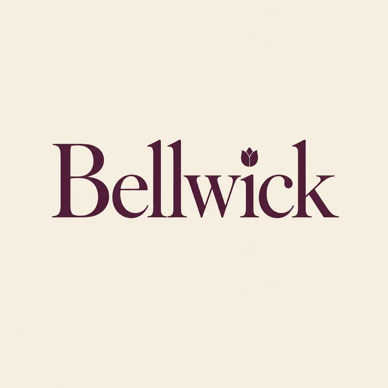
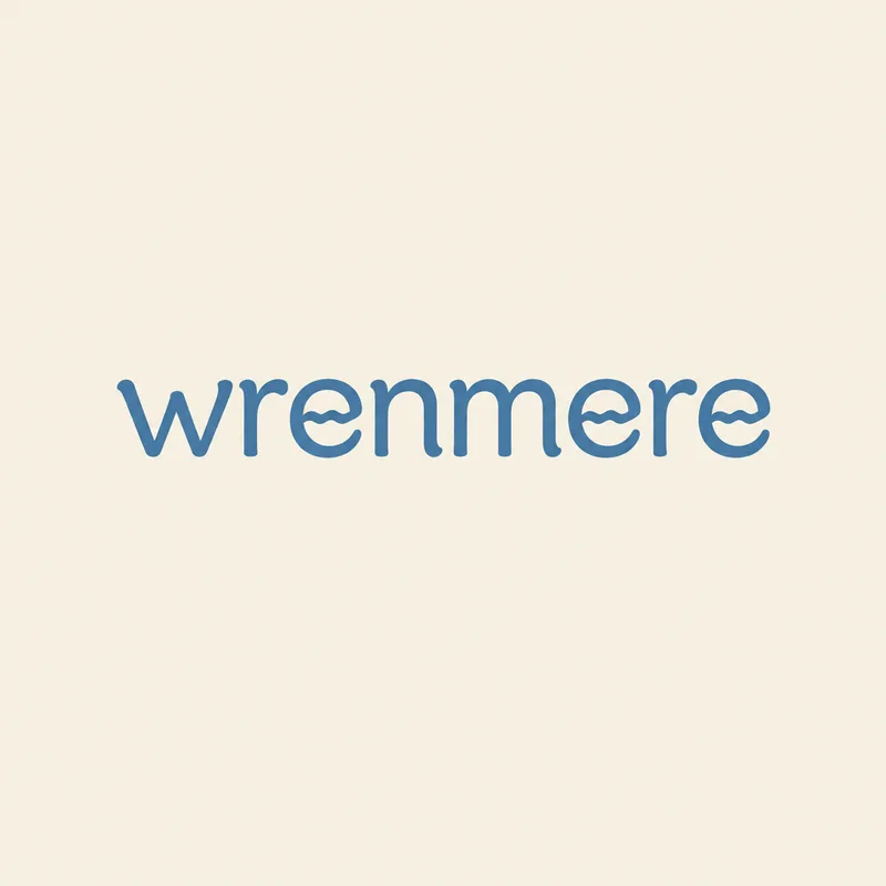
Wrenmere, a lakeside specialty coffee shop, is drawn as lowercase lettering in medium-weight, soft, slightly rounded strokes in lake blue. Its single idea is that the crossbar of both letters e is replaced by a small wavy ripple line, like wind on still water, while the letters stay readable. Bellwick, a neighbourhood florist, is drawn in a high-contrast serif with a capital B in deep plum. Its single idea is that the dot of the i is a small closed tulip bud.
The agent made one generation per turn, two in total. In its replies it described the ripple in both e letters for the first board and the tulip-bud dot for the second, plus the colour and margin. It did not report spelling checks or edit passes, so the correct letters and the clarity of the ripple and the bud should be judged on the boards.
The tip from this brief: ask for one idea in one letterform, say exactly which letter carries it, and specify the stroke weight and ink colour, so the model has a single clear job instead of a general request for something distinctive.
The request
Create a finished square 1:1 logo presentation board for Wrenmere, a bright lakeside specialty coffee shop. The only writing is the brand name "Wrenmere", exactly those eight letters, drawn as original custom lowercase lettering with medium-weight, soft, slightly rounded strokes rather than a stock font, carefully kerned. One clear idea in the letterforms: in both letters "e" the horizontal crossbar is replaced by a small wavy ripple line, like a breath of wind on still lake water, so the ripple is obvious at first glance while the letters stay perfectly readable. One solid soft lake-blue ink on a flat warm off-white ground, centred at about 60% of the frame width with generous margin. Flat vector, no texture, mockup, shadow or gradient. The brand is invented and the mark must not resemble any real company's logo. No other words, no tagline, no ® or ™.
What the agent did
Loaded the Logo design skill — Iterate logos, marks, and full lockup variations on the canvas.
I'll design this as a single custom-lowercase wordmark board — calm, warm, one lake-blue ink.
Generated an image ·
Here's the board: a bespoke lowercase "wrenmere" wordmark, medium-weight soft-rounded strokes, with the crossbar of both e's drawn as a small wind ripple — one solid lake-blue ink on warm off-white, flat vector, generous margin.
Next, I can set the mark on a deep lake-blue reverse for a dark-background check, or draw a small standalone ripple icon for app and cup use.
Outputs
Follow-up 1
Create a finished square 1:1 logo presentation board for Bellwick, a small neighbourhood florist. The only writing is the brand name "Bellwick", exactly those eight letters, drawn as original custom lettering in an elegant high-contrast serif style with a capital B, not a stock font, carefully kerned. One idea in one letterform: the dot of the "i" is a small closed tulip bud. One solid deep plum ink on a flat warm off-white ground, centred at about 60% of the frame width with generous margin. Flat vector, no texture, mockup, shadow or gradient. The brand is invented and the mark must not resemble any real company's logo. No other words, no tagline, no ® or ™.
What the agent did
New brand, new mark — same board format, now an elegant high-contrast serif with the tulip-bud "i".
Generated an image ·
Here's the Bellwick board: bespoke high-contrast serif lettering with a capital B, deep plum on warm off-white, and the only flourish being the closed tulip bud standing in as the dot of the "i" — everything else left plain and classical.
I can also do a reverse version on deep plum, or a small standalone tulip-bud mark for the shop window and packaging.
Outputs